This article describes how to combine multiple ggplots into a figure. To achieve this task, there are many R function/packages, including:
- grid.arrange() [gridExtra package]
- plot_grid() [cowplot package]
- plot_layout() [patchwork package]
- ggarrange() [ggpubr package]
The function ggarrange() [ggpubr] is one of the easiest solution for arranging multiple ggplots.
Here, you will learn how to use:
- ggplot2 facet functions for creating multiple panel figures that share the same axes
- ggarrange() function for combining independent ggplots
Contents:
Related Book
GGPlot2 Essentials for Great Data Visualization in RLoading required R packages
Load the ggplot2 package and set the default theme to theme_bw() with the legend at the top of the plot:
library(ggplot2)
library("ggpubr")
theme_set(
  theme_bw() +
    theme(legend.position = "top")
  )
Basic ggplot
Create a box plot filled by groups:
# Load data and convert dose to a factor variable
data("ToothGrowth")
ToothGrowth$dose <- as.factor(ToothGrowth$dose)
# Box plot
p <- ggplot(ToothGrowth, aes(x = dose, y = len)) +
  geom_boxplot(aes(fill = supp), position = position_dodge(0.9)) +
  scale_fill_manual(values = c("#00AFBB", "#E7B800"))
p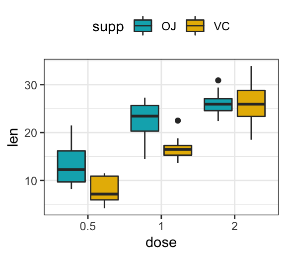
Multiple panels figure using ggplot facet
Facets divide a ggplot into subplots based on the values of one or more categorical variables.
When you are creating multiple plots that share axes, you should consider using facet functions from ggplot2
You write your ggplot2 code as if you were putting all of the data onto one plot, and then you use one of the faceting functions to indicate how to slice up the graph.
There are two main facet functions in the ggplot2 package:
facet_grid(), which layouts panels in a grid. It creates a matrix of panels defined by row and column faceting variablesfacet_wrap(), which wraps a 1d sequence of panels into 2d. This is generally a better use of screen space than facet_grid() because most displays are roughly rectangular.
Using facet_grid
- Facet with one discrete variable. Split by the levels of the group “supp”
# Split in vertical direction
p + facet_grid(rows = vars(supp))
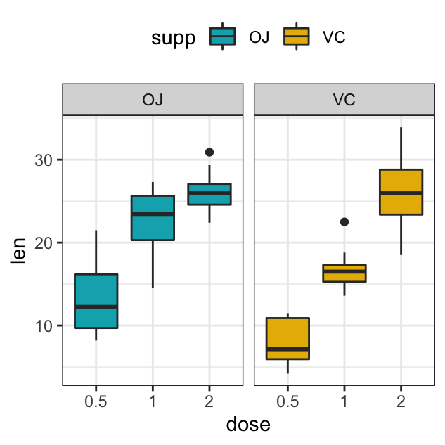
# Split in horizontal direction
p + facet_grid(cols = vars(supp))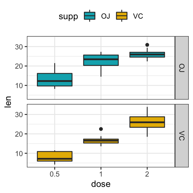
- Facet with multiple variables. Split by the levels of two grouping variables: “dose” and “supp”
# Facet by two variables: dose and supp.
# Rows are dose and columns are supp
p + facet_grid(rows = vars(dose), cols = vars(supp))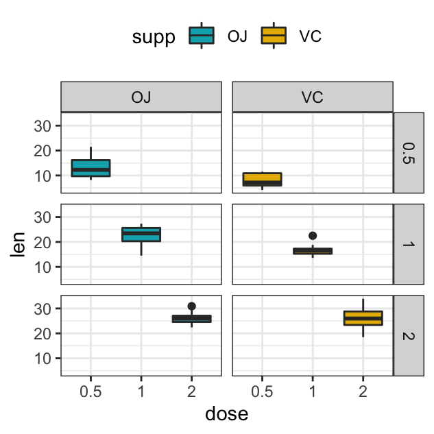
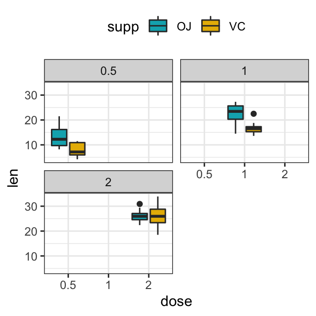
Using facet_wrap
facet_wrap: Facets can be placed side by side using the function facet_wrap() as follow :
p + facet_wrap(vars(dose))

p + facet_wrap(vars(dose), ncol=2)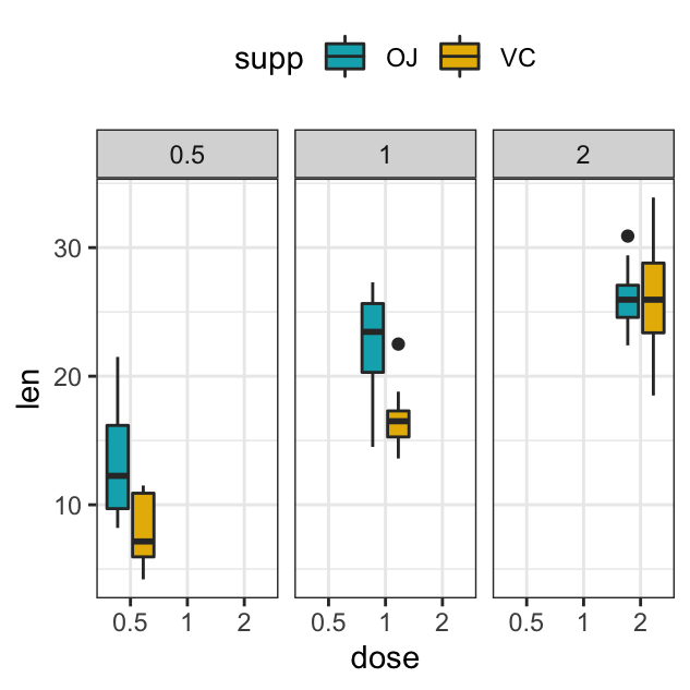
Facet scales
By default, all the panels have the same scales (scales="fixed"). They can be made independent, by setting scales to free, free_x, or free_y.
p + facet_grid(rows = vars(dose), cols = vars(supp), scales = "free")Combine multiple ggplots using ggarrange()
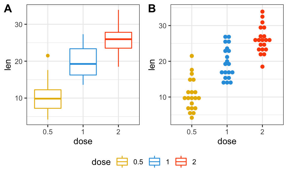
Create some basic plots
# 0. Define custom color palette and prepare the data
my3cols <- c("#E7B800", "#2E9FDF", "#FC4E07")
ToothGrowth$dose <- as.factor(ToothGrowth$dose)

# 1. Create a box plot (bp)
p <- ggplot(ToothGrowth, aes(x = dose, y = len))
bxp <- p + geom_boxplot(aes(color = dose)) +
  scale_color_manual(values = my3cols)

# 2. Create a dot plot (dp)
dp <- p + geom_dotplot(aes(color = dose, fill = dose),
                       binaxis='y', stackdir='center') +
  scale_color_manual(values = my3cols) +
  scale_fill_manual(values = my3cols)

# 3. Create a line plot
lp <- ggplot(economics, aes(x = date, y = psavert)) +
  geom_line(color = "#E46726")
Combine the plots on one page
figure <- ggarrange(bxp, dp, lp,
                    labels = c("A", "B", "C"),
                    ncol = 2, nrow = 2)
figure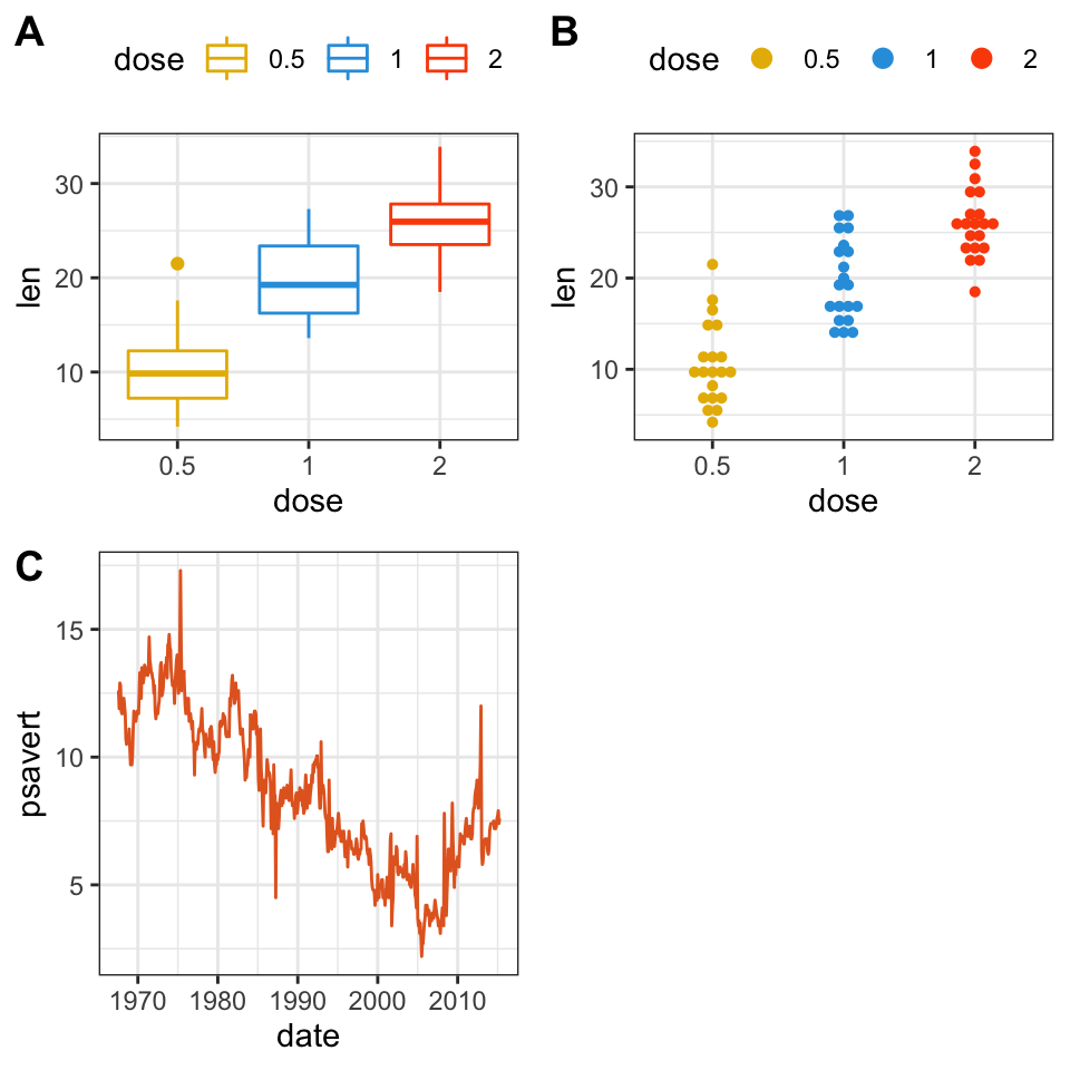
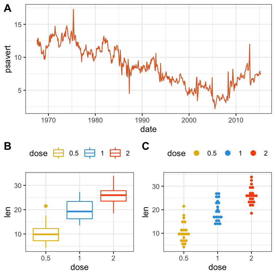
Change column and row span of a plot
We’ll use nested ggarrange() functions to change column/row span of plots. For example, using the R code below:
- the line plot (lp) will live in the first row and spans over two columns
- the box plot (bxp) and the dot plot (dp) will be first arranged and will live in the second row with two different columns
ggarrange(
  lp,                # First row with line plot
  # Second row with box and dot plots
  ggarrange(bxp, dp, ncol = 2, labels = c("B", "C")),
  nrow = 2,
  labels = "A"       # Label of the line plot
) 
Use shared legend for combined ggplots
To place a common unique legend in the margin of the arranged plots, the function ggarrange() [in ggpubr] can be used with the following arguments:
common.legend = TRUE: place a common legend in a marginlegend: specify the legend position. Allowed values include one of c(“top”, “bottom”, “left”, “right”)
ggarrange(
  bxp, dp, labels = c("A", "B"),
  common.legend = TRUE, legend = "bottom"
  )
Combine the plots over multiple pages
If you have a long list of ggplots, say n = 20 plots, you may want to arrange the plots and to place them on multiple pages. With 4 plots per page, you need 5 pages to hold the 20 plots.
The function ggarrange() [ggpubr] provides a convenient solution to arrange multiple ggplots over multiple pages. After specifying the arguments nrow and ncol,ggarrange()` computes automatically the number of pages required to hold the list of the plots. It returns a list of arranged ggplots.
For example the following R code,
multi.page <- ggarrange(bxp, dp, lp, bxp,
                        nrow = 1, ncol = 2)
returns a list of two pages with two plots per page. You can visualize each page as follow:
multi.page[[1]] # Visualize page 1
multi.page[[2]] # Visualize page 2
You can also export the arranged plots to a pdf file using the function ggexport() [ggpubr]:
ggexport(multi.page, filename = "multi.page.ggplot2.pdf")See the PDF file: Multi.page.ggplot2
Export the arranged plots
R function: ggexport() [in ggpubr].
- Export the arranged figure to a pdf, eps or png file (one figure per page).
ggexport(figure, filename = "figure1.pdf")- It’s also possible to arrange the plots (2 plot per page) when exporting them.
Export individual plots to a pdf file (one plot per page):
ggexport(bxp, dp, lp, bxp, filename = "test.pdf")Arrange and export. Specify the nrow and ncol arguments to display multiple plots on the same page:
ggexport(bxp, dp, lp, bxp, filename = "test.pdf",
         nrow = 2, ncol = 1)
Conclusion
This article describes how to create a multiple plots figure using the ggplot2 facet functions and the ggarrange() function available in the ggpubr package. We also show how to export the arranged plots.
Recommended for you
This section contains best data science and self-development resources to help you on your path.
Books - Data Science
Our Books
- Practical Guide to Cluster Analysis in R by A. Kassambara (Datanovia)
- Practical Guide To Principal Component Methods in R by A. Kassambara (Datanovia)
- Machine Learning Essentials: Practical Guide in R by A. Kassambara (Datanovia)
- R Graphics Essentials for Great Data Visualization by A. Kassambara (Datanovia)
- GGPlot2 Essentials for Great Data Visualization in R by A. Kassambara (Datanovia)
- Network Analysis and Visualization in R by A. Kassambara (Datanovia)
- Practical Statistics in R for Comparing Groups: Numerical Variables by A. Kassambara (Datanovia)
- Inter-Rater Reliability Essentials: Practical Guide in R by A. Kassambara (Datanovia)
Others
- R for Data Science: Import, Tidy, Transform, Visualize, and Model Data by Hadley Wickham & Garrett Grolemund
- Hands-On Machine Learning with Scikit-Learn, Keras, and TensorFlow: Concepts, Tools, and Techniques to Build Intelligent Systems by Aurelien Géron
- Practical Statistics for Data Scientists: 50 Essential Concepts by Peter Bruce & Andrew Bruce
- Hands-On Programming with R: Write Your Own Functions And Simulations by Garrett Grolemund & Hadley Wickham
- An Introduction to Statistical Learning: with Applications in R by Gareth James et al.
- Deep Learning with R by François Chollet & J.J. Allaire
- Deep Learning with Python by François Chollet
Version:
 Français

Hi, thanks a lot for the codes. I would like to know that after applying ggarrange(), how can I export the combined graphs and change the font to “serif”. I use postscript and dev.off if I only have one graph, but it doesn’t work for multigraphs. Thanks!
Hi, did you try the function ggexport() [in ggpubr package]? It should work, see the documentation (https://rpkgs.datanovia.com/ggpubr/reference/ggexport.html).
Consider using the extension “.ps” when specifying the exported file name.
Thank you so much