A Scatter plot (also known as X-Y plot or Point graph) is used to display the relationship between two continuous variables x and y.
By displaying a variable in each axis, it is possible to determine if an association or a correlation exists between the two variables.
The correlation can be: positive (values increase together), negative (one value decreases as the other increases), null (no correlation), linear, exponential and U-shaped.
This article describes how to create scatter plots in R using the ggplot2 package.
You will learn how to:
- Color points by groups
- Create bubble charts
- Add regression line to a scatter plot
Contents:
Related Book
GGPlot2 Essentials for Great Data Visualization in RData preparation
Demo dataset: mtcars. The variable cyl is used as grouping variable.
# Load data
data("mtcars")
df <- mtcars

# Convert cyl as a grouping variable
df$cyl <- as.factor(df$cyl)

# Inspect the data
head(df[, c("wt", "mpg", "cyl", "qsec")], 4)
## wt mpg cyl qsec
## Mazda RX4 2.62 21.0 6 16.5
## Mazda RX4 Wag 2.88 21.0 6 17.0
## Datsun 710 2.32 22.8 4 18.6
## Hornet 4 Drive 3.21 21.4 6 19.4Loading required R package
Load the ggplot2 package and set the default theme to theme_bw() with the legend at the top of the plot:
library(ggplot2)
theme_set(
  theme_bw() +
    theme(legend.position = "top")
  )
Basic scatter plots
- Key functions:
geom_point()for creating scatter plots. - Key arguments:
color,sizeandshapeto change point color, size and shape.
# Initiate a ggplot
b <- ggplot(df, aes(x = wt, y = mpg))
# Basic scatter plot
b + geom_point()
# Change color, shape and size
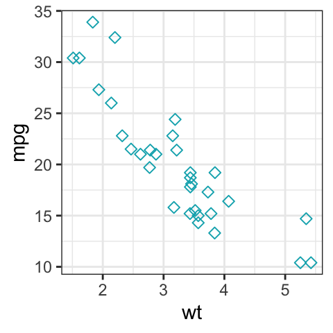
b + geom_point(color = "#00AFBB", size = 2, shape = 23)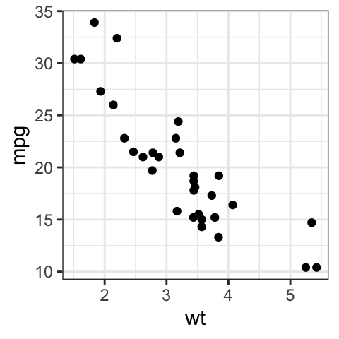
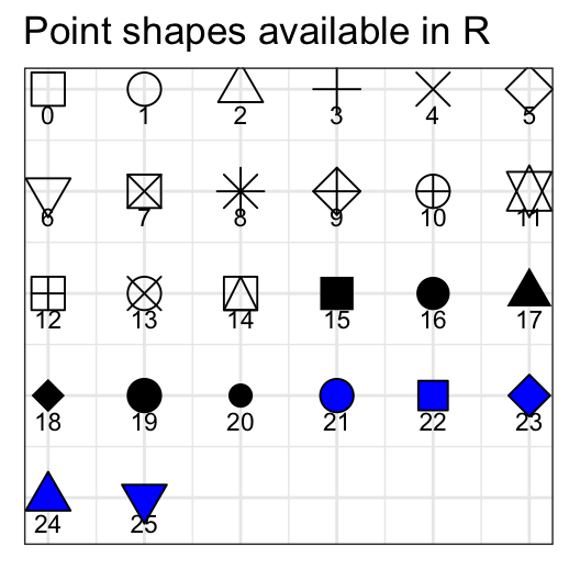
The different point shapes commonly used in R, include:
Scatter plots with multiple groups
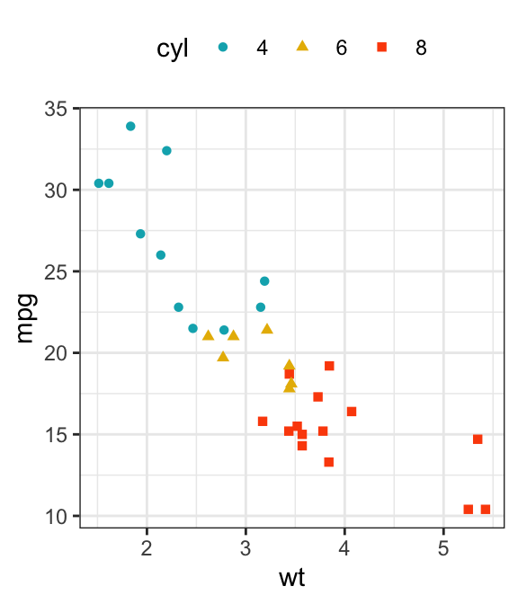
This section describes how to change point colors and shapes by groups. The functions scale_color_manual() and scale_shape_manual() are used to manually customize the color and the shape of points, respectively.
In the R code below, point shapes and colors are controlled by the levels of the grouping variable cyl :
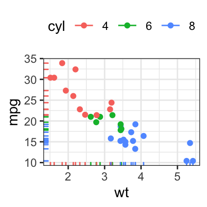
# Change point shapes by the levels of cyl
b + geom_point(aes(shape = cyl))

# Change point shapes and colors by the levels of cyl
# Set custom colors
b + geom_point(aes(shape = cyl, color = cyl)) +
  scale_color_manual(values = c("#00AFBB", "#E7B800", "#FC4E07"))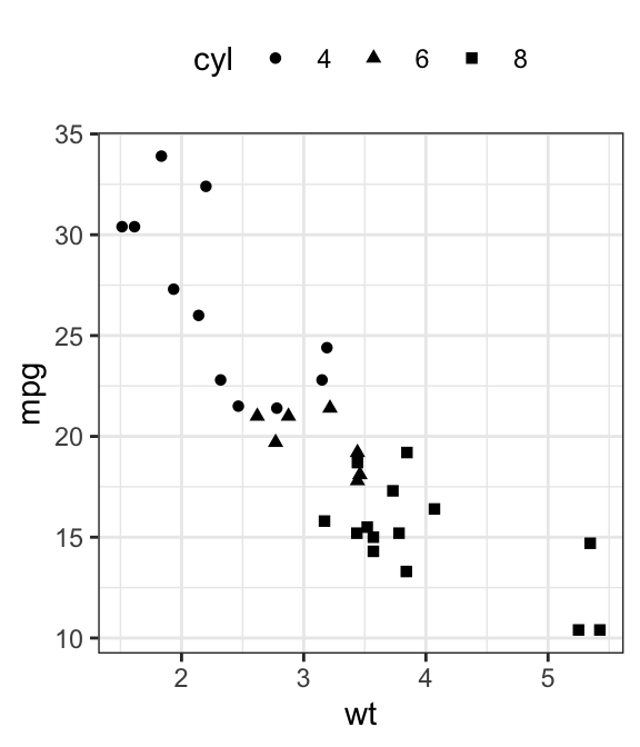
Add regression lines
- Key R function:
geom_smooth()for adding smoothed conditional means / regression line. - Key arguments:
color,sizeandlinetype: Change the line color, size and type.fill: Change the fill color of the confidence region.
A simplified format of the function `geom_smooth():
geom_smooth(method="auto", se=TRUE, fullrange=FALSE, level=0.95)- method : smoothing method to be used. Possible values are lm, glm, gam, loess, rlm.
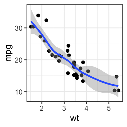
- method = “loess”: This is the default value for small number of observations. It computes a smooth local regression. You can read more about loess using the R code ?loess.
- method =“lm”: It fits a linear model. Note that, it’s also possible to indicate the formula as formula = y ~ poly(x, 3) to specify a degree 3 polynomial.
- se : logical value. If TRUE, confidence interval is displayed around smooth.
- fullrange : logical value. If TRUE, the fit spans the full range of the plot
- level : level of confidence interval to use. Default value is 0.95
To add a regression line on a scatter plot, the function geom_smooth() is used in combination with the argument method = lm. lm stands for linear model.
# Add regression line
b + geom_point() + geom_smooth(method = lm)
# Point + regression line
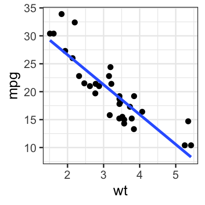
# Remove the confidence interval
b + geom_point() +
geom_smooth(method = lm, se = FALSE)
# loess method: local regression fitting
b + geom_point() + geom_smooth()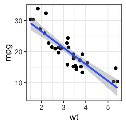
Change point color and shapes by groups:
# Change color and shape by groups (cyl)
b + geom_point(aes(color = cyl, shape=cyl)) +
geom_smooth(aes(color = cyl, fill = cyl), method = lm) +
scale_color_manual(values = c("#00AFBB", "#E7B800", "#FC4E07"))+
scale_fill_manual(values = c("#00AFBB", "#E7B800", "#FC4E07"))
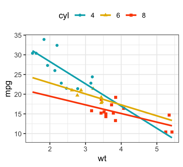
# Remove confidence intervals
# Extend the regression lines: fullrange
b + geom_point(aes(color = cyl, shape = cyl)) +
geom_smooth(aes(color = cyl), method = lm, se = FALSE, fullrange = TRUE) +
scale_color_manual(values = c("#00AFBB", "#E7B800", "#FC4E07"))+
scale_fill_manual(values = c("#00AFBB", "#E7B800", "#FC4E07"))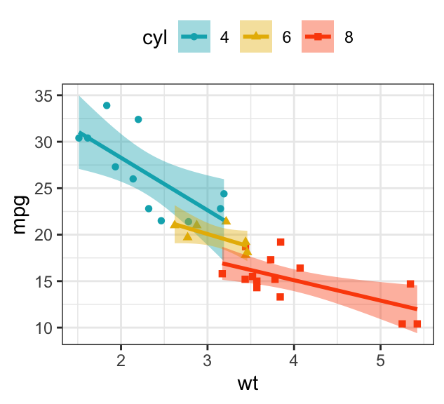
Add marginal rugs to a scatter plot
The function geom_rug() is used to display display individual cases on the plot.
# Add marginal rugs
b + geom_point() + geom_rug()
# Change colors by groups
b + geom_point(aes(color = cyl)) +
geom_rug(aes(color = cyl))
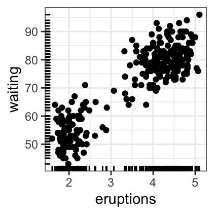
# Add marginal rugs using faithful data
data(faithful)
ggplot(faithful, aes(x = eruptions, y = waiting)) +
geom_point() + geom_rug()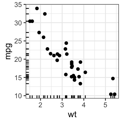
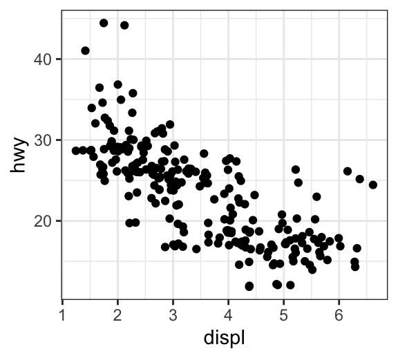
Jitter points to reduce overplotting
The mpg data set [in ggplot2] is used in the following examples.
To reduce overplotting, the option position = position_jitter() with the arguments width and height are used:
- width: degree of jitter in x direction.
- height: degree of jitter in y direction.
# Default plot
ggplot(mpg, aes(displ, hwy)) +
  geom_point()

# Use jitter to reduce overplotting
ggplot(mpg, aes(displ, hwy)) +
  geom_point(position = position_jitter(width = 0.5, height = 0.5))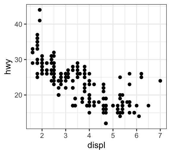
Add point text labels
Key functions:
geom_text()andgeom_label(): ggplot2 standard functions to add text to a plot.geom_text_repel()andgeom_label_repel()[in ggrepel package]. Repulsive textual annotations. Avoid text overlapping.
First install ggrepel (ìnstall.packages("ggrepel")), then type this:
library(ggrepel)

# Add text to the plot
.labs <- rownames(df)
b + geom_point(aes(color = cyl)) +
  geom_text_repel(aes(label = .labs,  color = cyl), size = 3)+
  scale_color_manual(values = c("#00AFBB", "#E7B800", "#FC4E07"))
# Draw a rectangle underneath the text, making it easier to read.
b + geom_point(aes(color = cyl)) +
  geom_label_repel(aes(label = .labs,  color = cyl), size = 3)+
  scale_color_manual(values = c("#00AFBB", "#E7B800", "#FC4E07"))
Bubble chart
In a bubble chart, points size is controlled by a continuous variable, here qsec. In the R code below, the argument alpha is used to control color transparency. alpha should be between 0 and 1.
b + geom_point(aes(color = cyl, size = qsec), alpha = 0.5) +
  scale_color_manual(values = c("#00AFBB", "#E7B800", "#FC4E07")) +
  scale_size(range = c(0.5, 12))  # Adjust the range of points size
Color by a continuous variable
- Color points according to the values of the continuous variable: “mpg”.
- Change the default blue gradient color using the function
scale_color_gradientn()[in ggplot2], by specifying two or more colors.
b + geom_point(aes(color = mpg), size = 3) +
  scale_color_gradientn(colors = c("#00AFBB", "#E7B800", "#FC4E07")) +
  theme(legend.position = "right")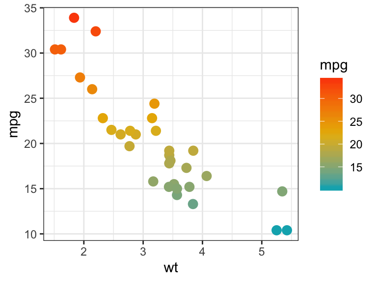
Recommended for you
This section contains best data science and self-development resources to help you on your path.
Books - Data Science
Our Books
- Practical Guide to Cluster Analysis in R by A. Kassambara (Datanovia)
- Practical Guide To Principal Component Methods in R by A. Kassambara (Datanovia)
- Machine Learning Essentials: Practical Guide in R by A. Kassambara (Datanovia)
- R Graphics Essentials for Great Data Visualization by A. Kassambara (Datanovia)
- GGPlot2 Essentials for Great Data Visualization in R by A. Kassambara (Datanovia)
- Network Analysis and Visualization in R by A. Kassambara (Datanovia)
- Practical Statistics in R for Comparing Groups: Numerical Variables by A. Kassambara (Datanovia)
- Inter-Rater Reliability Essentials: Practical Guide in R by A. Kassambara (Datanovia)
Others
- R for Data Science: Import, Tidy, Transform, Visualize, and Model Data by Hadley Wickham & Garrett Grolemund
- Hands-On Machine Learning with Scikit-Learn, Keras, and TensorFlow: Concepts, Tools, and Techniques to Build Intelligent Systems by Aurelien Géron
- Practical Statistics for Data Scientists: 50 Essential Concepts by Peter Bruce & Andrew Bruce
- Hands-On Programming with R: Write Your Own Functions And Simulations by Garrett Grolemund & Hadley Wickham
- An Introduction to Statistical Learning: with Applications in R by Gareth James et al.
- Deep Learning with R by François Chollet & J.J. Allaire
- Deep Learning with Python by François Chollet
Version:
 Français

No Comments