What is ggplot2
GGPlot2 is a powerful and a flexible R package, implemented by Hadley Wickham, for producing elegant graphics piece by piece (Wickham et al. 2017).
The gg in ggplot2 means Grammar of Graphics, a graphic concept which describes plots by using a “grammar”. According to the ggplot2 concept, a plot can be divided into different fundamental parts: Plot = data + Aesthetics + Geometry
- data: a data frame
- aesthetics: used to indicate the x and y variables. It can be also used to control the color, the size and the shape of points, etc…..
- geometry: corresponds to the type of graphics (histogram, box plot, line plot, ….)
The ggplot2 syntax might seem opaque for beginners, but once you understand the basics, you can create and customize any kind of plots you want.
Note that, to reduce this opacity, we recently created an R package, named ggpubr (ggplot2 Based Publication Ready Plots), for making ggplot simpler for students and researchers with non-advanced programming backgrounds.
Contents:
Related Book
GGPlot2 Essentials for Great Data Visualization in RKey functions
After installing and loading the ggplot2 package, you can use the following key functions:
| Plot types | GGPlot2 functions |
|---|---|
| Initialize a ggplot | ggplot() |
| Scatter plot | geom_point() |
| Box plot | geom_boxplot() |
| Violin plot | geom_violin() |
| strip chart | geom_jitter() |
| Dot plot | geom_dotplot() |
| Bar chart | geom_bar() or geom_col() |
| Line plot | geom_line() |
| Histogram | geom_histogram() |
| Density plot | geom_density() |
| Error bars | geom_errorbar() |
| QQ plot | stat_qq() |
| ECDF plot | stat_ecdf() |
| Title and axis labels | labs() |
Example of plots
The main function in the ggplot2 package is ggplot(), which can be used to initialize the plotting system with data and x/y variables.
For example, the following R code takes the iris data set to initialize the ggplot and then a layer (geom_point()) is added onto the ggplot to create a scatter plot of x = Sepal.Length by y = Sepal.Width:
library(ggplot2)
ggplot(iris, aes(x = Sepal.Length, y = Sepal.Width))+
  geom_point()

# Change point size, color and shape
ggplot(iris, aes(x = Sepal.Length, y = Sepal.Width))+
  geom_point(size = 1.2, color = "steelblue", shape = 21)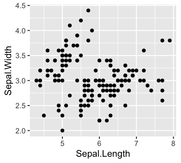
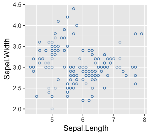
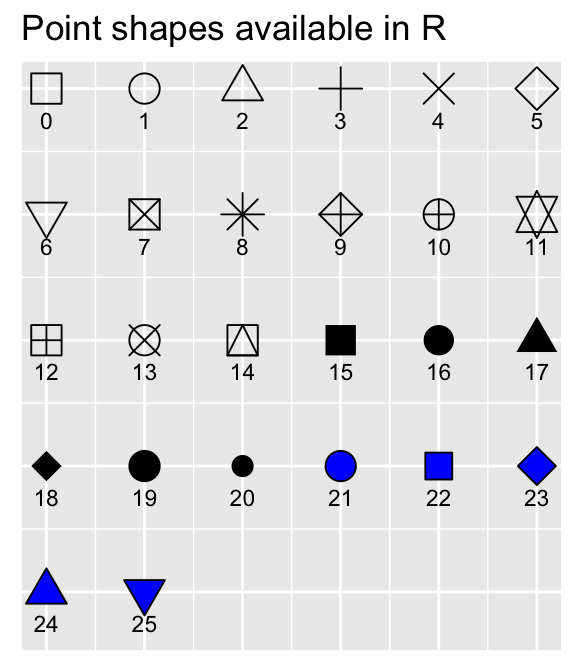
Note that, in the code above, the shape of points is specified as number. The different point shape available in R, include:
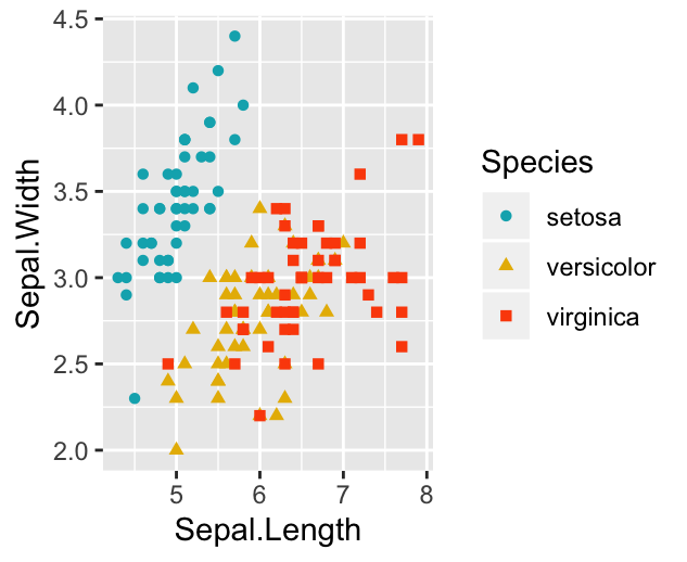
It’s also possible to control points shape and color by a grouping variable (here, Species). For example, in the code below, we map points color and shape to the Species grouping variable.
Note that, a ggplot can be holded in a variable, say p, to be printed later
# Control points color by groups
ggplot(iris, aes(x = Sepal.Length, y = Sepal.Width))+
  geom_point(aes(color = Species, shape = Species))

# Change the default color manually.
# Use the scale_color_manual() function
p <- ggplot(iris, aes(x = Sepal.Length, y = Sepal.Width))+
  geom_point(aes(color = Species, shape = Species))+
  scale_color_manual(values = c("#00AFBB", "#E7B800", "#FC4E07"))
print(p)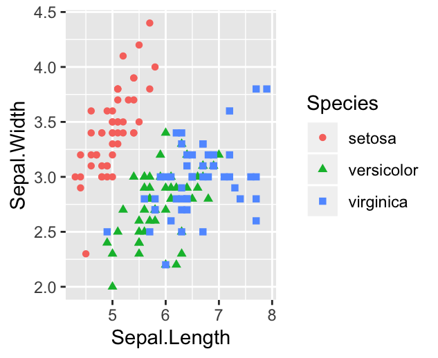
Legend position
The default legend position is “right”. Use the function theme() with the argument legend.position to specify the legend position.
Allowed values for the legend position include: “left”, “top”, “right”, “bottom”, “none”.
Examples:
# Change legend position to the top
p + theme(legend.position = "top")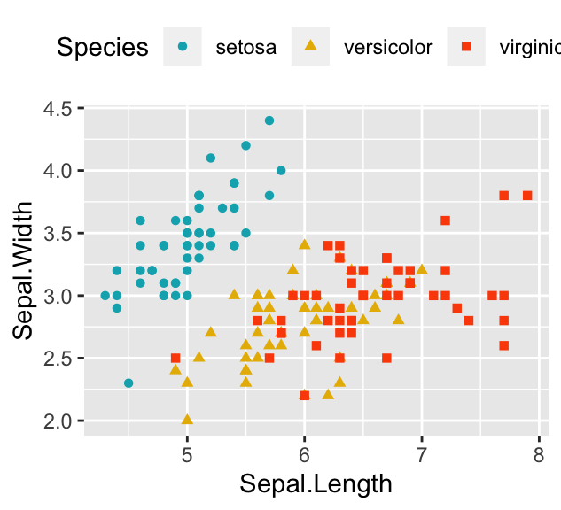
To remove legend, use p + theme(legend.position = “none”).
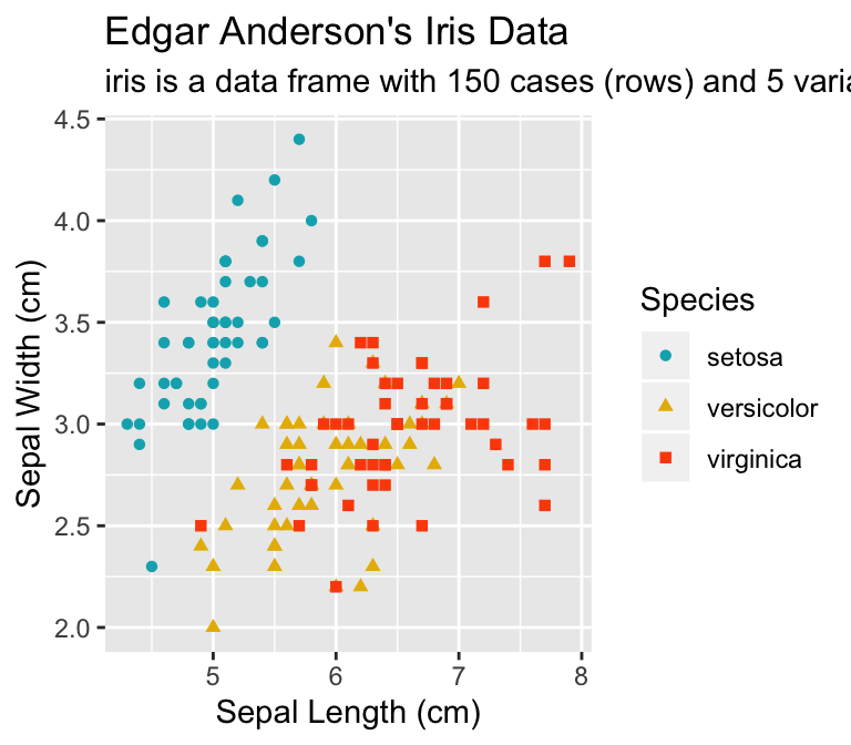
Titles and axis labels
The function labs() can be used to change easily the main title, the subtitle, the axis labels and captions.
p + labs(
  title = "Edgar Anderson's Iris Data",
  subtitle = "iris is a data frame with 150 cases (rows) and 5 variables",
  x = "Sepal Length (cm)", y = "Sepal Width (cm)"
  )
Facet: Plot with multiple pnels
You can also split the plot into multiple panels according to a grouping variable. R function: facet_wrap(). Another interesting feature of ggplot2, is the possibility to combine multiple layers on the same plot. For example, with the following R code, we’ll:
- Add points with
geom_point(), colored by groups. - Add the fitted smoothed regression line using
geom_smooth(). By default the functiongeom_smooth()add the regression line and the confidence area. You can control the line color and confidence area fill color by groups. - Facet the plot into multiple panels by groups
- Change color and fill manually using the function
scale_color_manual()andscale_fill_manual()
ggplot(iris, aes(x = Sepal.Length, y = Sepal.Width))+
  geom_point(aes(color = Species))+
  geom_smooth(aes(color = Species, fill = Species))+
  facet_wrap(~Species, ncol = 3, nrow = 1)+
  scale_color_manual(values = c("#00AFBB", "#E7B800", "#FC4E07"))+
  scale_fill_manual(values = c("#00AFBB", "#E7B800", "#FC4E07"))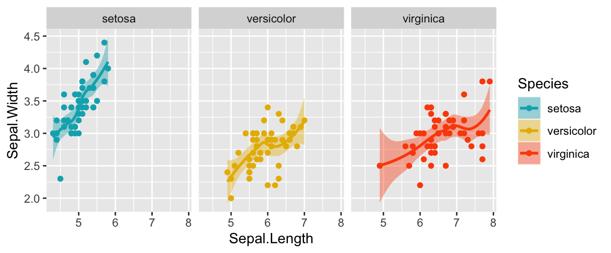
GGPlot theme
Note that, the default theme of ggplots is theme_gray() (or theme_grey()), which is theme with grey background and white grid lines. More themes are available for professional presentations or publications. These include: theme_bw(), theme_classic() and theme_minimal().
To change the theme of a given ggplot (p), use this: p + theme_classic(). To change the default theme to theme_classic() for all the future ggplots during your entire R session, type the following R code:
theme_set(
  theme_classic()
)
Now you can create ggplots with theme_classic() as default theme:
ggplot(iris, aes(x = Sepal.Length, y = Sepal.Width))+
  geom_point()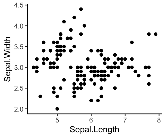
Further customizations of a ggplot
You can read more in our online ggplot cheatsheet, GGPlot Cheat Sheet for Great Customization, which describes how to:
- Add title, subtitle, caption and change axis labels
- Change the appearance - color, size and face - of titles
- Set the axis limits
- Set a logarithmic axis scale
- Rotate axis text labels
- Change the legend title and position, as well, as the color and the size
- Change a ggplot theme and modify the background color
- Add a background image to a ggplot
- Use different color palettes: custom color palettes, color-blind friendly palettes, RColorBrewer palettes, viridis color palettes and scientific journal color palettes.
- Change point shapes (plotting symbols) and line types
- Rotate a ggplot
- Annotate a ggplot by adding straight lines, arrows, rectangles and text.
Save ggplots
You can export a ggplot to many file formats, including: PDF, SVG vector files, PNG, TIFF, JPEG, etc.
The standard procedure to save any graphics from R is as follow:
- Open a graphic device using one of the following functions:
- pdf(“r-graphics.pdf”),
- svg(“r-graphics.svg”),
- png(“r-graphics.png”),
- tiff(“r-graphics.tiff”),
- jpeg(“r-graphics.jpg”),
- and so on.
Additional arguments indicating the width and the height (in inches) of the graphics region can be also specified in the mentioned function.
- Create and print a plot
- Close the graphic device using the function
dev.off()
For example, to export ggplot2 graphs to a pdf file, the R code looks like this:
# Create some plots
library(ggplot2)
myplot1 <- ggplot(iris, aes(Sepal.Length, Sepal.Width)) +
  geom_point()
myplot2 <- ggplot(iris, aes(Species, Sepal.Length)) +
  geom_boxplot()

# Print plots to a pdf file
pdf("ggplot.pdf")
print(myplot1)     # Plot 1 --> in the first page of PDF
print(myplot2)     # Plot 2 ---> in the second page of the PDF
dev.off()
For printing to a png file, use:
png("myplot.png")
print(myplot)
dev.off()
It’s also possible to make a ggplot and to save it from the screen using the function ggsave():
# 1. Create a plot: displayed on the screen (by default)
ggplot(mtcars, aes(wt, mpg)) + geom_point()
# 2.1. Save the plot to a pdf
ggsave("myplot.pdf")
# 2.2 OR save it to png file
ggsave("myplot.png")
Conclusion
This article explains the basics of ggplot2 and shows how to export a ggplot to a PDF or PNG file.
References
Wickham, Hadley, Winston Chang, Lionel Henry, Thomas Lin Pedersen, Kohske Takahashi, Claus Wilke, Kara Woo, and Hiroaki Yutani. 2017. Ggplot2: Create Elegant Data Visualisations Using the Grammar of Graphics.
Recommended for you
This section contains best data science and self-development resources to help you on your path.
Books - Data Science
Our Books
- Practical Guide to Cluster Analysis in R by A. Kassambara (Datanovia)
- Practical Guide To Principal Component Methods in R by A. Kassambara (Datanovia)
- Machine Learning Essentials: Practical Guide in R by A. Kassambara (Datanovia)
- R Graphics Essentials for Great Data Visualization by A. Kassambara (Datanovia)
- GGPlot2 Essentials for Great Data Visualization in R by A. Kassambara (Datanovia)
- Network Analysis and Visualization in R by A. Kassambara (Datanovia)
- Practical Statistics in R for Comparing Groups: Numerical Variables by A. Kassambara (Datanovia)
- Inter-Rater Reliability Essentials: Practical Guide in R by A. Kassambara (Datanovia)
Others
- R for Data Science: Import, Tidy, Transform, Visualize, and Model Data by Hadley Wickham & Garrett Grolemund
- Hands-On Machine Learning with Scikit-Learn, Keras, and TensorFlow: Concepts, Tools, and Techniques to Build Intelligent Systems by Aurelien Géron
- Practical Statistics for Data Scientists: 50 Essential Concepts by Peter Bruce & Andrew Bruce
- Hands-On Programming with R: Write Your Own Functions And Simulations by Garrett Grolemund & Hadley Wickham
- An Introduction to Statistical Learning: with Applications in R by Gareth James et al.
- Deep Learning with R by François Chollet & J.J. Allaire
- Deep Learning with Python by François Chollet
Version:
 Français

No Comments