ECDF (or Empirical cumulative distribution function) provides an alternative visualization of distribution. It reports for any given number the percent of individuals that are below that threshold.
This article describes how to create an ECDF in R using the function stat_ecdf() in ggplot2 package.
Contents:
Related Book
GGPlot2 Essentials for Great Data Visualization in RData preparation
Create some data (wdata) containing the weights by sex (M for male; F for female):
set.seed(1234)
wdata = data.frame(
        sex = factor(rep(c("F", "M"), each=200)),
        weight = c(rnorm(200, 55), rnorm(200, 58))
        )

# head(wdata, 4)
Loading required R package
Load the ggplot2 package and set the default theme to theme_minimal() with the legend at the top of the plot:
library(ggplot2)
theme_set(
  theme_minimal() +
    theme(legend.position = "top")
  )
Create ECDF plots
# Another option for geom = "point"
ggplot(wdata, aes(x = weight)) +
  stat_ecdf(aes(color = sex,linetype = sex),
              geom = "step", size = 1.5) +
  scale_color_manual(values = c("#00AFBB", "#E7B800"))+
  labs(y = "f(weight)")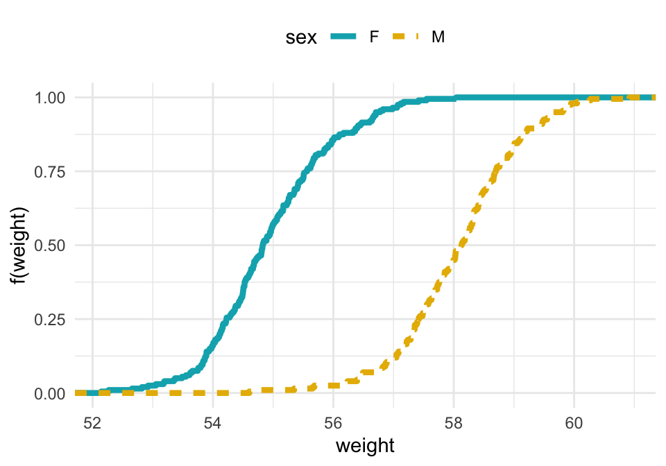
In the above plots, you can see that:
- about 25% of our females are shorter than 50 inches
- about 50% of males are shorter than 58 inches
Conclusion
This article shows how to create an ECDF plot using the ggplot2 R package.
Recommended for you
This section contains best data science and self-development resources to help you on your path.
Books - Data Science
Our Books
- Practical Guide to Cluster Analysis in R by A. Kassambara (Datanovia)
- Practical Guide To Principal Component Methods in R by A. Kassambara (Datanovia)
- Machine Learning Essentials: Practical Guide in R by A. Kassambara (Datanovia)
- R Graphics Essentials for Great Data Visualization by A. Kassambara (Datanovia)
- GGPlot2 Essentials for Great Data Visualization in R by A. Kassambara (Datanovia)
- Network Analysis and Visualization in R by A. Kassambara (Datanovia)
- Practical Statistics in R for Comparing Groups: Numerical Variables by A. Kassambara (Datanovia)
- Inter-Rater Reliability Essentials: Practical Guide in R by A. Kassambara (Datanovia)
Others
- R for Data Science: Import, Tidy, Transform, Visualize, and Model Data by Hadley Wickham & Garrett Grolemund
- Hands-On Machine Learning with Scikit-Learn, Keras, and TensorFlow: Concepts, Tools, and Techniques to Build Intelligent Systems by Aurelien Géron
- Practical Statistics for Data Scientists: 50 Essential Concepts by Peter Bruce & Andrew Bruce
- Hands-On Programming with R: Write Your Own Functions And Simulations by Garrett Grolemund & Hadley Wickham
- An Introduction to Statistical Learning: with Applications in R by Gareth James et al.
- Deep Learning with R by François Chollet & J.J. Allaire
- Deep Learning with Python by François Chollet
Version:
 Français

No Comments