Error Bars are used to visualize the variability of the plotted data. Error Bars can be applied to graphs such as, Dot Plots, Barplots or Line Graphs, to provide an additional layer of detail on the presented data.
Generally, Error bars are used to show either the standard deviation, standard error, confidence intervals or interquartile range.
The length of an Error Bar helps reveal the uncertainty of a data point: a short Error Bar shows that values are concentrated, signalling that the plotted average value is more likely, while a long Error Bar would indicate that the values are more spread out and less reliable.
This article describes how to add error bars into a plot using the ggplot2 R package. You will learn how to create bar plots and line plots with error bars
Contents:
Related Book
GGPlot2 Essentials for Great Data Visualization in RLoading required R package
Load the ggplot2 package and set the default theme to theme_classic() with the legend at the top of the plot:
library(ggplot2)
theme_set(
  theme_classic() +
    theme(legend.position = "top")
  )
Data preparation
- Prepare the data:
ToothGrowthdata set.
df <- ToothGrowth
df$dose <- as.factor(df$dose)
head(df, 3)
## len supp dose
## 1 4.2 VC 0.5
## 2 11.5 VC 0.5
## 3 7.3 VC 0.5- Compute summary statistics for the variable
lenorganized into groups by the variabledose:
library(dplyr)
df.summary <- df %>%
  group_by(dose) %>%
  summarise(
    sd = sd(len, na.rm = TRUE),
    len = mean(len)
  )
df.summary
## # A tibble: 3 x 3
## dose sd len
## <fct> <dbl> <dbl>
## 1 0.5 4.50 10.6
## 2 1 4.42 19.7
## 3 2 3.77 26.1Key R functions and error plot types
Key functions to create error plots using the summary statistics data:
geom_crossbar()for hollow bar with middle indicated by horizontal linegeom_errorbar()for error barsgeom_errorbarh()for horizontal error barsgeom_linerange()for drawing an interval represented by a vertical linegeom_pointrange()for creating an interval represented by a vertical line, with a point in the middle.
Start by initializing ggplot with the summary statistics data:
- Specify x and y as usually
- Specify
ymin = len-sdandymax = len+sdto add lower and upper error bars. If you want only to add upper error bars but not the lower ones, useymin = len(instead oflen-sd) andymax = len+sd.
# Initialize ggplot with data
f <- ggplot(
  df.summary,
  aes(x = dose, y = len, ymin = len-sd, ymax = len+sd)
  )
Possible error plots:
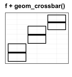
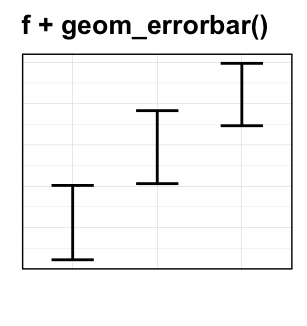
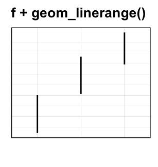
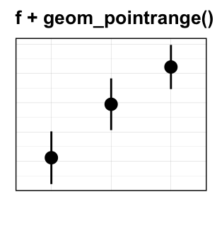
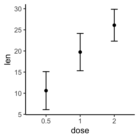
Basic error bars
Create simple error plots:
# Vertical line with point in the middle
f + geom_pointrange()

# Standard error bars
f + geom_errorbar(width = 0.2) +
  geom_point(size = 1.5)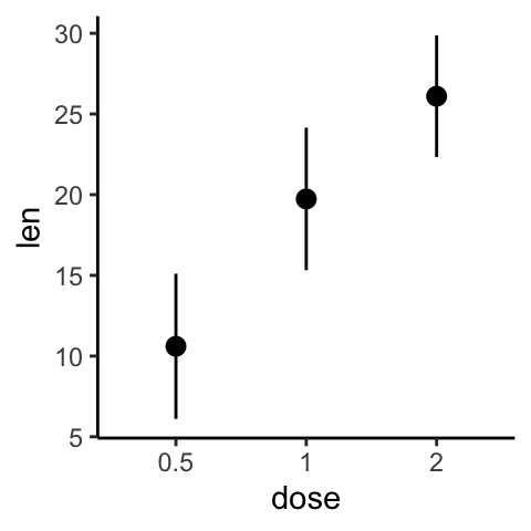
Create horizontal error bars. Put dose on y axis and len on x-axis. Specify xmin and xmax.
# Horizontal error bars with mean points
# Change the color by groups
ggplot(df.summary, aes(x = len, y = dose, xmin = len-sd, xmax = len+sd)) +
  geom_point() +
  geom_errorbarh(height=.2)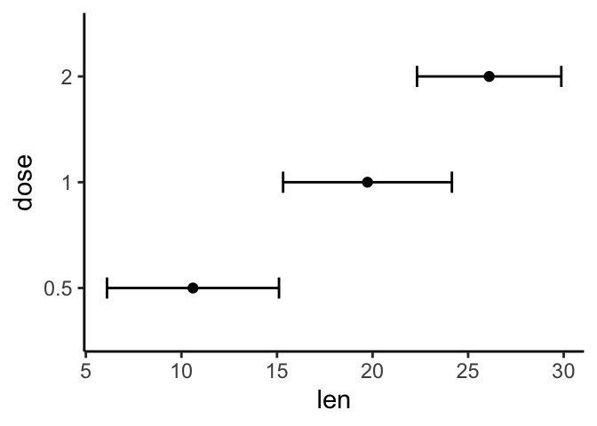
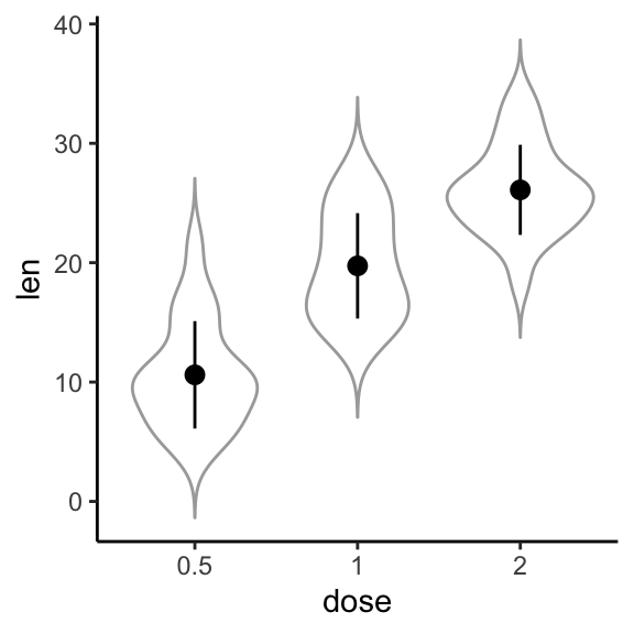
- Add jitter points (representing individual points), dot plots and violin plots. For this, you should initialize ggplot with original data (
df) and specify thedf.summarydata in the error plot function, heregeom_pointrange().
# Combine with jitter points
ggplot(df, aes(dose, len)) +
  geom_jitter(position = position_jitter(0.2), color = "darkgray") +
  geom_pointrange(aes(ymin = len-sd, ymax = len+sd),data = df.summary)

# Combine with violin plots
ggplot(df, aes(dose, len)) +
  geom_violin(color = "darkgray", trim = FALSE) +
  geom_pointrange(aes(ymin = len-sd, ymax = len+sd), data = df.summary)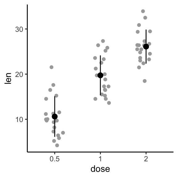
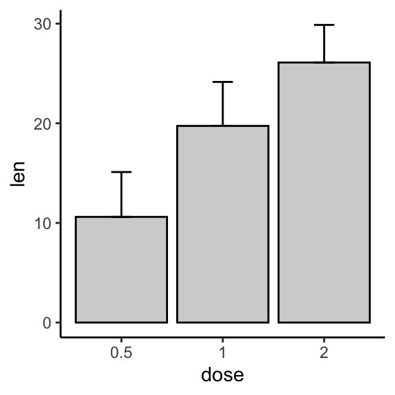
- Create basic bar/line plots of mean +/- error. So we need only the
df.summarydata. :- Add lower and upper error bars for the line plot:
ymin = len-sdandymax = len+sd. - Add only upper error bars for the bar plot:
ymin = len(instead oflen-sd) andymax = len+sd.
- Add lower and upper error bars for the line plot:
Note that, for line plot, you should always specify group = 1 in the aes(), when you have one group of line.
# (1) Line plot
ggplot(df.summary, aes(dose, len)) +
geom_line(aes(group = 1)) +
geom_errorbar( aes(ymin = len-sd, ymax = len+sd),width = 0.2) +
geom_point(size = 2)
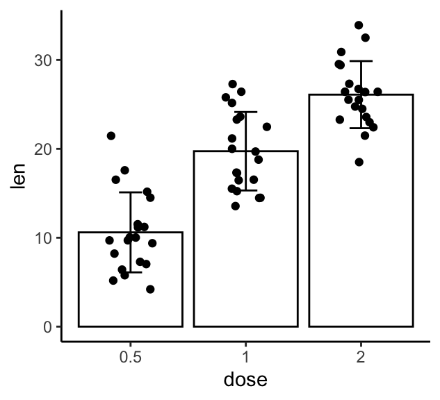
# (2) Bar plot
ggplot(df.summary, aes(dose, len)) +
geom_col(fill = "lightgray", color = "black") +
geom_errorbar(aes(ymin = len, ymax = len+sd), width = 0.2) 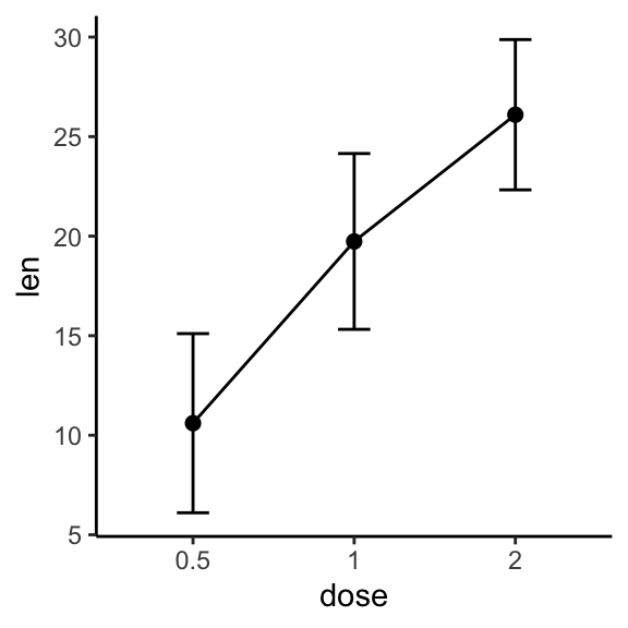
For line plot, you might want to treat x-axis as numeric:
df.sum2 <- df.summary
df.sum2$dose <- as.numeric(df.sum2$dose)
ggplot(df.sum2, aes(dose, len)) +
  geom_line() +
  geom_errorbar( aes(ymin = len-sd, ymax = len+sd),width = 0.2) +
  geom_point(size = 2)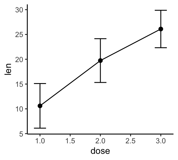
- Bar plots and line plots + jitter points. We need the original
dfdata for the jitter points and thedf.summarydata for the othergeomlayers.- For the line plot: First, add jitter points, then add lines + error bars + mean points on top of the jitter points.
- For the bar plot: First, add the bar plot, then add jitter points + error bars on top of the bars.
# (1) Create a line plot of means +
# individual jitter points + error bars
ggplot(df, aes(dose, len)) +
  geom_jitter( position = position_jitter(0.2), color = "darkgray") +
  geom_line(aes(group = 1), data = df.summary) +
  geom_errorbar(
    aes(ymin = len-sd, ymax = len+sd),
    data = df.summary, width = 0.2) +
  geom_point(data = df.summary, size = 2)

# (2) Bar plots of means + individual jitter points + errors
ggplot(df, aes(dose, len)) +
  geom_col(data = df.summary, fill = NA, color = "black") +
  geom_jitter( position = position_jitter(0.2), color = "black") +
  geom_errorbar( aes(ymin = len-sd, ymax = len+sd),
data = df.summary, width = 0.2) 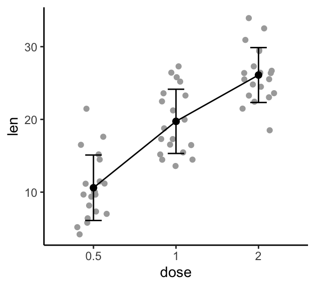
Grouped error bars
Case of one continuous variable (len) and two grouping variables (dose, supp).
- Compute the summary statistics of
lengrouped bydoseandsupp:
library(dplyr)
df.summary2 <- df %>%
  group_by(dose, supp) %>%
  summarise(
    sd = sd(len),
    len = mean(len)
  )
df.summary2
## # A tibble: 6 x 4
## # Groups: dose [?]
## dose supp sd len
## <fct> <fct> <dbl> <dbl>
## 1 0.5 OJ 4.46 13.2
## 2 0.5 VC 2.75 7.98
## 3 1 OJ 3.91 22.7
## 4 1 VC 2.52 16.8
## 5 2 OJ 2.66 26.1
## 6 2 VC 4.80 26.1- Create error plots for multiple groups:
- pointrange colored by groups (supp)
- standard error bars + mean points colored by groups (supp)
# (1) Pointrange: Vertical line with point in the middle
ggplot(df.summary2, aes(dose, len)) +
geom_pointrange(
aes(ymin = len-sd, ymax = len+sd, color = supp),
position = position_dodge(0.3)
)+
scale_color_manual(values = c("#00AFBB", "#E7B800"))
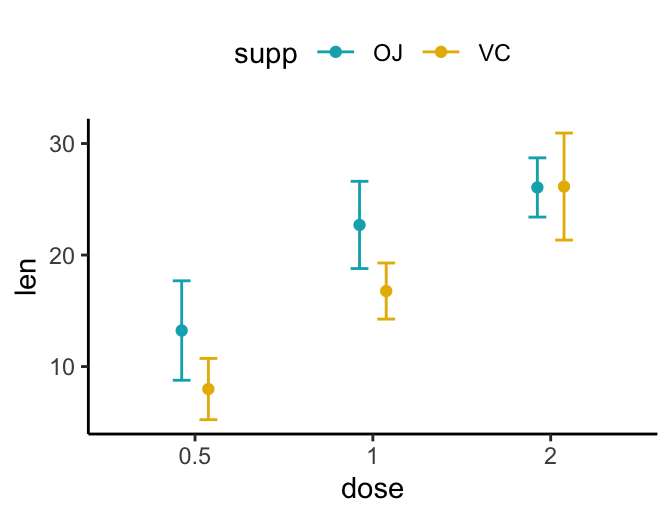
# (2) Standard error bars
ggplot(df.summary2, aes(dose, len)) +
geom_errorbar(
aes(ymin = len-sd, ymax = len+sd, color = supp),
position = position_dodge(0.3), width = 0.2
)+
geom_point(aes(color = supp), position = position_dodge(0.3)) +
scale_color_manual(values = c("#00AFBB", "#E7B800")) 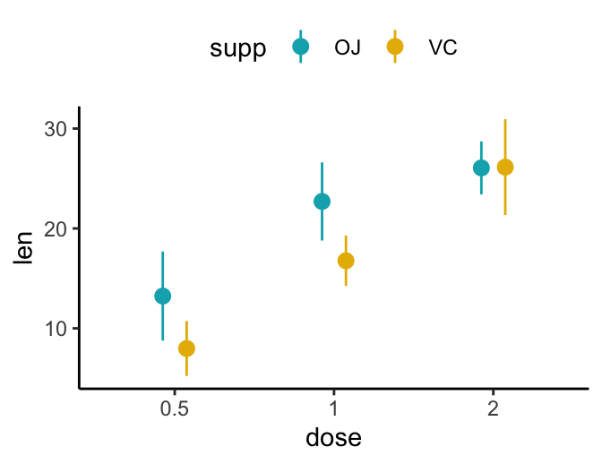
- Create simple line/bar plots for multiple groups.
- Line plots: change linetype by groups (
supp) - Bar plots: change fill color by groups (
supp)
- Line plots: change linetype by groups (
# (1) Line plot + error bars
ggplot(df.summary2, aes(dose, len)) +
geom_line(aes(linetype = supp, group = supp))+
geom_point()+
geom_errorbar(
aes(ymin = len-sd, ymax = len+sd, group = supp),
width = 0.2
)
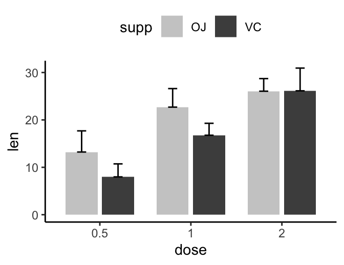
# (2) Bar plots + upper error bars.
ggplot(df.summary2, aes(dose, len)) +
geom_col(aes(fill = supp), position = position_dodge(0.8), width = 0.7)+
geom_errorbar(
aes(ymin = len, ymax = len+sd, group = supp),
width = 0.2, position = position_dodge(0.8)
)+
scale_fill_manual(values = c("grey80", "grey30"))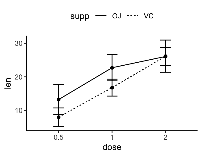
- Add jitter points:
# Line plots with jittered points
ggplot(df, aes(dose, len, color = supp)) +
geom_jitter(position = position_jitter(0.2)) +
geom_line(aes(group = supp),data = df.summary2) +
geom_errorbar(aes(ymin = len-sd, ymax = len+sd), data = df.summary2, width = 0.2)+
scale_color_manual(values = c("#00AFBB", "#E7B800")) +
theme(legend.position = "top")
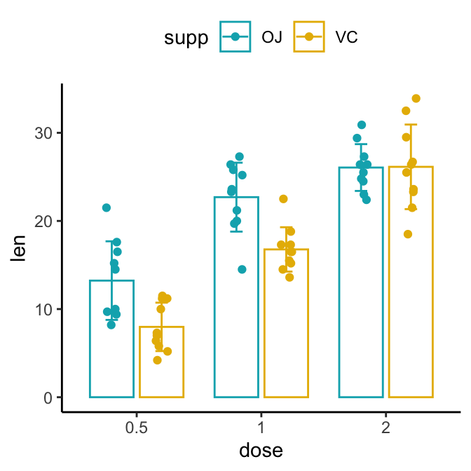
# Bar plots + jittered points + error bars
ggplot(df, aes(dose, len, color = supp)) +
geom_col(data = df.summary2, position = position_dodge(0.8),
width = 0.7, fill = "white") +
geom_jitter(
position = position_jitterdodge(jitter.width = 0.2, dodge.width = 0.8)
) +
geom_errorbar(
aes(ymin = len-sd, ymax = len+sd), data = df.summary2,
width = 0.2, position = position_dodge(0.8)
)+
scale_color_manual(values = c("#00AFBB", "#E7B800")) +
theme(legend.position = "top")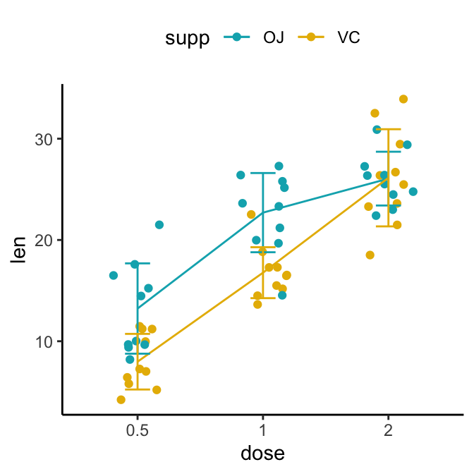
Conclusion
This article describes how to add error bars to plots created using the ggplot2 R package.
Recommended for you
This section contains best data science and self-development resources to help you on your path.
Books - Data Science
Our Books
- Practical Guide to Cluster Analysis in R by A. Kassambara (Datanovia)
- Practical Guide To Principal Component Methods in R by A. Kassambara (Datanovia)
- Machine Learning Essentials: Practical Guide in R by A. Kassambara (Datanovia)
- R Graphics Essentials for Great Data Visualization by A. Kassambara (Datanovia)
- GGPlot2 Essentials for Great Data Visualization in R by A. Kassambara (Datanovia)
- Network Analysis and Visualization in R by A. Kassambara (Datanovia)
- Practical Statistics in R for Comparing Groups: Numerical Variables by A. Kassambara (Datanovia)
- Inter-Rater Reliability Essentials: Practical Guide in R by A. Kassambara (Datanovia)
Others
- R for Data Science: Import, Tidy, Transform, Visualize, and Model Data by Hadley Wickham & Garrett Grolemund
- Hands-On Machine Learning with Scikit-Learn, Keras, and TensorFlow: Concepts, Tools, and Techniques to Build Intelligent Systems by Aurelien Géron
- Practical Statistics for Data Scientists: 50 Essential Concepts by Peter Bruce & Andrew Bruce
- Hands-On Programming with R: Write Your Own Functions And Simulations by Garrett Grolemund & Hadley Wickham
- An Introduction to Statistical Learning: with Applications in R by Gareth James et al.
- Deep Learning with R by François Chollet & J.J. Allaire
- Deep Learning with Python by François Chollet
Version:
 Français

When I try to run this code, it goes smoothly until I get to “f + geom_pointrange()” or try to plot “f”. The error returned is “Error in FUN(X[[i]], …) : object ‘dose’ not found” which is the error from my own data that lead me to look up this tutorial. How do I make “dose” a findable object?