Stripcharts are also known as one dimensional scatter plots. These plots are suitable compared to box plots when sample sizes are small.
This article describes how to create and customize Stripcharts using the ggplot2 R package.
Contents:
Related Book
GGPlot2 Essentials for Great Data Visualization in RKey R functions
- Key function:
geom_jitter() - key arguments:
color,fill,size,shape. Changes points color, fill, size and shape
Data preparation
- Demo dataset:
ToothGrowth- Continuous variable:
len(tooth length). Used on y-axis - Grouping variable:
dose(dose levels of vitamin C: 0.5, 1, and 2 mg/day). Used on x-axis.
- Continuous variable:
First, convert the variable dose from a numeric to a discrete factor variable:
data("ToothGrowth")
ToothGrowth$dose <- as.factor(ToothGrowth$dose)
head(ToothGrowth, 3)
## len supp dose
## 1 4.2 VC 0.5
## 2 11.5 VC 0.5
## 3 7.3 VC 0.5Loading required R package
Load the ggplot2 package and set the default theme to theme_classic() with the legend at the top of the plot:
library(ggplot2)
theme_set(
  theme_classic() +
    theme(legend.position = "top")
  )
Basic stripcharts
We start by initiating a plot named e, then we’ll add layers. The following R code creates stripcharts combined with summary statistics (mean +/- SD), boxplots and violin plots.
- Change points shape and color by groups
- Adjust the degree of jittering:
position_jitter(0.2) - Add summary statistics:
# Initiate a ggplot
e <- ggplot(ToothGrowth, aes(x = dose, y = len))

# Stripcharts with summary statistics
# Change color by dose groups
e + geom_jitter(aes(shape = dose, color = dose),
                position = position_jitter(0.2), size = 1.2) +
  stat_summary(aes(color = dose), size = 0.4,
               fun.data="mean_sdl",  fun.args = list(mult=1))+
  scale_color_manual(values =  c("#00AFBB", "#E7B800", "#FC4E07"))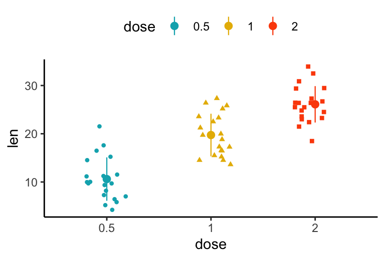
The function mean_sdl is used for adding mean and standard deviation. It computes the mean plus or minus a constant times the standard deviation. In the R code above, the constant is specified using the argument mult (mult = 1). By default mult = 2. The mean +/- SD can be added as a crossbar or a pointrange.
Combine with box plots and violin plots
# Combine with box plot
e + geom_boxplot() +
geom_jitter(position = position_jitter(0.2))
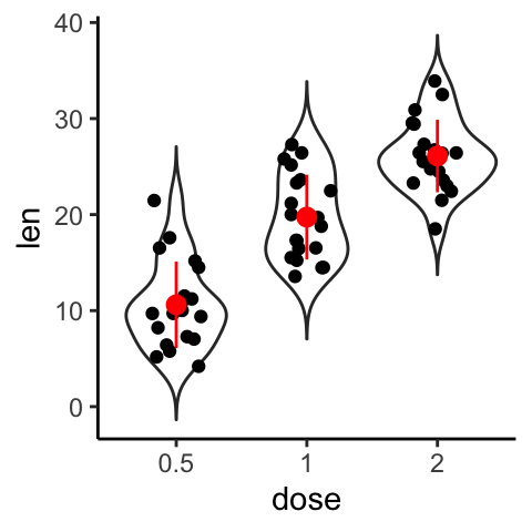
# Strip chart + violin plot + stat summary
e + geom_violin(trim = FALSE) +
geom_jitter(position = position_jitter(0.2)) +
stat_summary(fun.data="mean_sdl", fun.args = list(mult=1),
color = "red")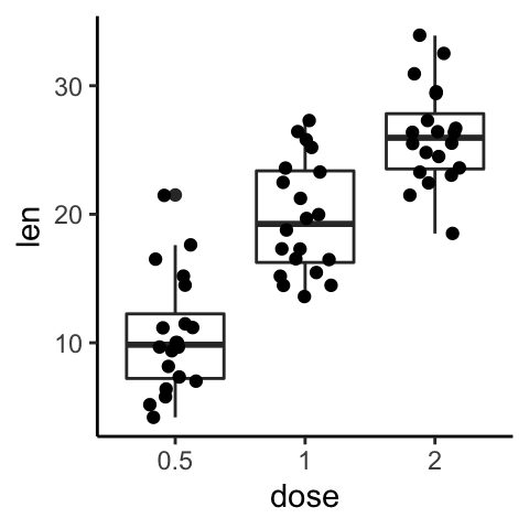
Create a stripchart with multiple groups
The R code is similar to what we have seen in dot plots section. However, to create dodged jitter points, you should use the function position_jitterdodge() instead of position_dodge().
e + geom_jitter(
  aes(shape = supp, color = supp), size = 1.2,
  position = position_jitterdodge(jitter.width = 0.2, dodge.width = 0.8)
  ) +
  stat_summary(
    aes(color = supp), fun.data="mean_sdl", fun.args = list(mult=1),
    size = 0.4, position = position_dodge(0.8)
    )+
  scale_color_manual(values =  c("#00AFBB", "#E7B800"))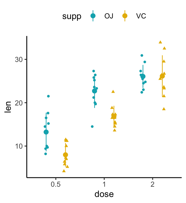
Conclusion
This article describes how to create a stripchart using the ggplot2 package.
Recommended for you
This section contains best data science and self-development resources to help you on your path.
Books - Data Science
Our Books
- Practical Guide to Cluster Analysis in R by A. Kassambara (Datanovia)
- Practical Guide To Principal Component Methods in R by A. Kassambara (Datanovia)
- Machine Learning Essentials: Practical Guide in R by A. Kassambara (Datanovia)
- R Graphics Essentials for Great Data Visualization by A. Kassambara (Datanovia)
- GGPlot2 Essentials for Great Data Visualization in R by A. Kassambara (Datanovia)
- Network Analysis and Visualization in R by A. Kassambara (Datanovia)
- Practical Statistics in R for Comparing Groups: Numerical Variables by A. Kassambara (Datanovia)
- Inter-Rater Reliability Essentials: Practical Guide in R by A. Kassambara (Datanovia)
Others
- R for Data Science: Import, Tidy, Transform, Visualize, and Model Data by Hadley Wickham & Garrett Grolemund
- Hands-On Machine Learning with Scikit-Learn, Keras, and TensorFlow: Concepts, Tools, and Techniques to Build Intelligent Systems by Aurelien Géron
- Practical Statistics for Data Scientists: 50 Essential Concepts by Peter Bruce & Andrew Bruce
- Hands-On Programming with R: Write Your Own Functions And Simulations by Garrett Grolemund & Hadley Wickham
- An Introduction to Statistical Learning: with Applications in R by Gareth James et al.
- Deep Learning with R by François Chollet & J.J. Allaire
- Deep Learning with Python by François Chollet
Version:
 Français

No Comments