In a line plot, observations are ordered by x value and connected by a line.
x value (for x axis) can be :
- date : for a time series data
- texts
- discrete numeric values
- continuous numeric values
This article describes how to create a line plot using the ggplot2 R package
You will learn how to:
- Create basic and grouped line plots
- Add points to a line plot
- Change the line types and colors by group
Contents:
Related Book
GGPlot2 Essentials for Great Data Visualization in RKey R functions
- Key functions:
geom_path()connects the observations in the order in which they appear in the data.geom_line()connects them in order of the variable on the x axis.geom_step()creates a stairstep plot, highlighting exactly when changes occur.
- Key arguments to customize the plot: alpha, color, linetype and size
Data preparation
We’ll create two data frames derived from the ToothGrowth datasets.
df <- data.frame(dose=c("D0.5", "D1", "D2"),
                len=c(4.2, 10, 29.5))

head(df, 4)
## dose len
## 1 D0.5 4.2
## 2 D1 10.0
## 3 D2 29.5df2 <- data.frame(supp=rep(c("VC", "OJ"), each=3),
dose=rep(c("D0.5", "D1", "D2"),2),
len=c(6.8, 15, 33, 4.2, 10, 29.5))
head(df2, 4)## supp dose len
## 1 VC D0.5 6.8
## 2 VC D1 15.0
## 3 VC D2 33.0
## 4 OJ D0.5 4.2len: Tooth lengthdose: Dose in milligrams (0.5, 1, 2)supp: Supplement type (VC or OJ)
Loading required R package
Load the ggplot2 package and set the default theme to theme_classic() with the legend at the top of the plot:
library(ggplot2)
theme_set(
  theme_classic() +
    theme(legend.position = "top")
  )
Basic line plots
p <- ggplot(data = df, aes(x = dose, y = len, group = 1))
# Basic line plot with points
p + geom_line() + geom_point()
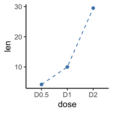
# Change line type and color
p + geom_line(linetype = "dashed", color = "steelblue")+
geom_point(color = "steelblue")
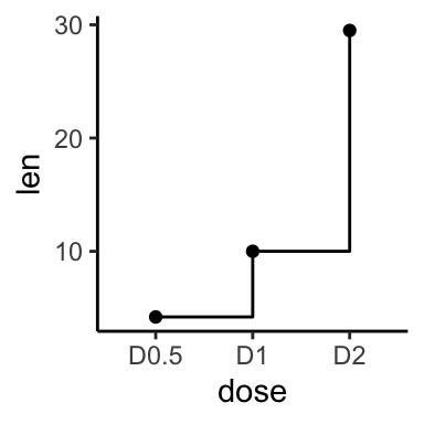
# Use geom_step()
p + geom_step() + geom_point()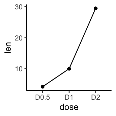
Note that, the group aesthetic determines which cases are connected together.
Line plot with multiple groups
In the graphs below, line types and point shapes are controlled automatically by the levels of the variable supp:
p <- ggplot(df2, aes(x = dose, y = len, group = supp))
# Change line types and point shapes by groups
p + geom_line(aes(linetype = supp)) +
geom_point(aes(shape = supp))
# Change line types, point shapes and colors
# Change color manually: custom color
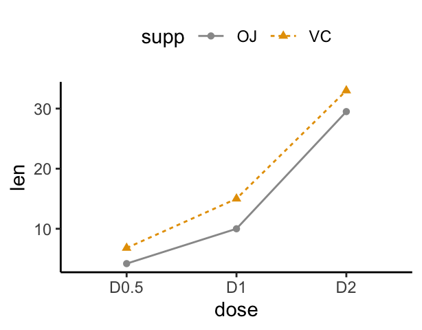
p + geom_line(aes(linetype = supp, color = supp))+
geom_point(aes(shape = supp, color = supp)) +
scale_color_manual(values=c("#999999", "#E69F00"))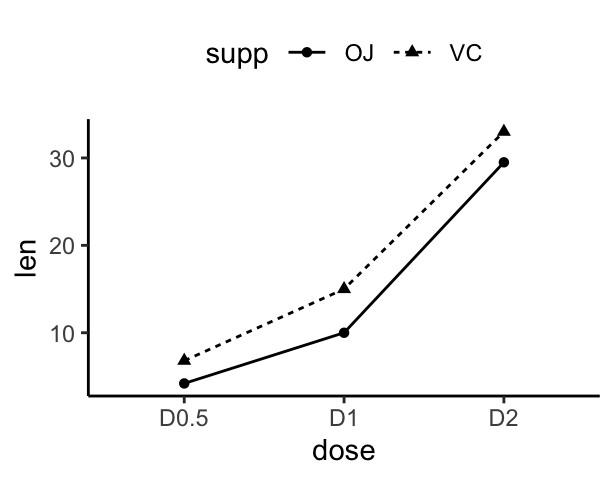
Line plot with a numeric x-axis
If the variable on x-axis is numeric, it can be useful to treat it as a continuous or a factor variable depending on what you want to do:
# Create some data
df3 <- data.frame(supp=rep(c("VC", "OJ"), each=3),
                dose=rep(c("0.5", "1", "2"),2),
                len=c(6.8, 15, 33, 4.2, 10, 29.5))
head(df3)
## supp dose len
## 1 VC 0.5 6.8
## 2 VC 1 15.0
## 3 VC 2 33.0
## 4 OJ 0.5 4.2
## 5 OJ 1 10.0
## 6 OJ 2 29.5# x axis treated as continuous variable
df3$dose <- as.numeric(as.vector(df3$dose))
ggplot(data = df3, aes(x = dose, y = len, group = supp, color = supp)) +
geom_line() + geom_point()
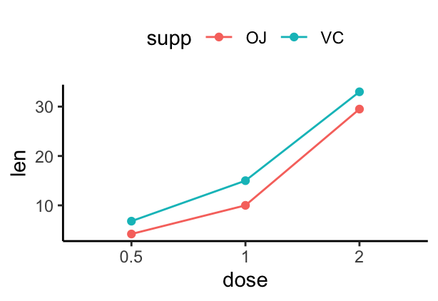
# Axis treated as discrete variable
df3$dose<-as.factor(df3$dose)
ggplot(data=df3, aes(x = dose, y = len, group = supp, color = supp)) +
geom_line() + geom_point()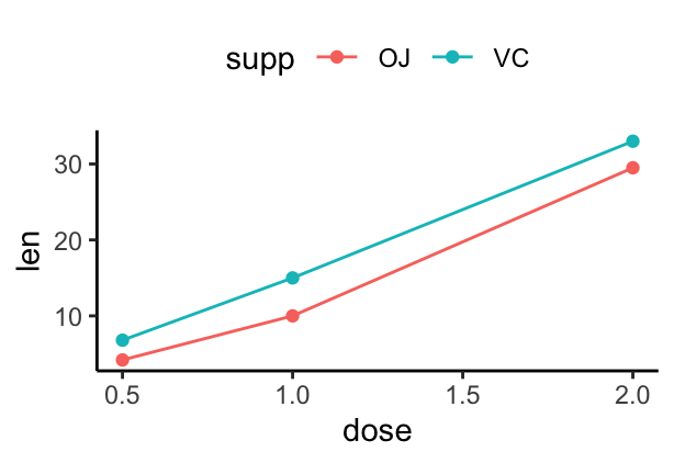
Line plot with dates on x-axis: Time series
economics time series data sets are used :
head(economics)## # A tibble: 6 x 6
## date pce pop psavert uempmed unemploy
## <date> <dbl> <int> <dbl> <dbl> <int>
## 1 1967-07-01 507. 198712 12.5 4.5 2944
## 2 1967-08-01 510. 198911 12.5 4.7 2945
## 3 1967-09-01 516. 199113 11.7 4.6 2958
## 4 1967-10-01 513. 199311 12.5 4.9 3143
## 5 1967-11-01 518. 199498 12.5 4.7 3066
## 6 1967-12-01 526. 199657 12.1 4.8 3018Plots :
# Basic line plot
ggplot(data=economics, aes(x = date, y = pop))+
geom_line()
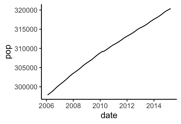
# Plot a subset of the data
ss <- subset(economics, date > as.Date("2006-1-1"))
ggplot(data = ss, aes(x = date, y = pop)) + geom_line()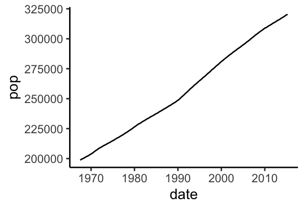
Change line size :
ggplot(data = economics, aes(x = date, y = pop)) +
  geom_line(aes(size = unemploy/pop))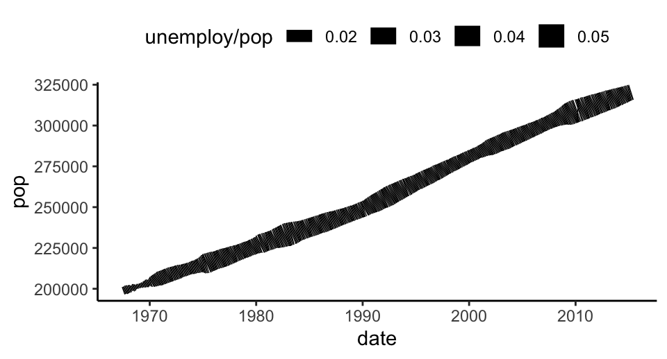
Plot multiple time series data:
ggplot(economics, aes(x=date)) +
  geom_line(aes(y = psavert), color = "darkred") +
geom_line(aes(y = uempmed), color="steelblue", linetype="twodash") 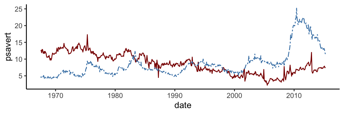
# Area plot
ggplot(economics, aes(x=date)) +
  geom_area(aes(y = psavert), fill = "#999999",
            color = "#999999", alpha=0.5) +
  geom_area(aes(y = uempmed), fill = "#E69F00",
color = "#E69F00", alpha=0.5) 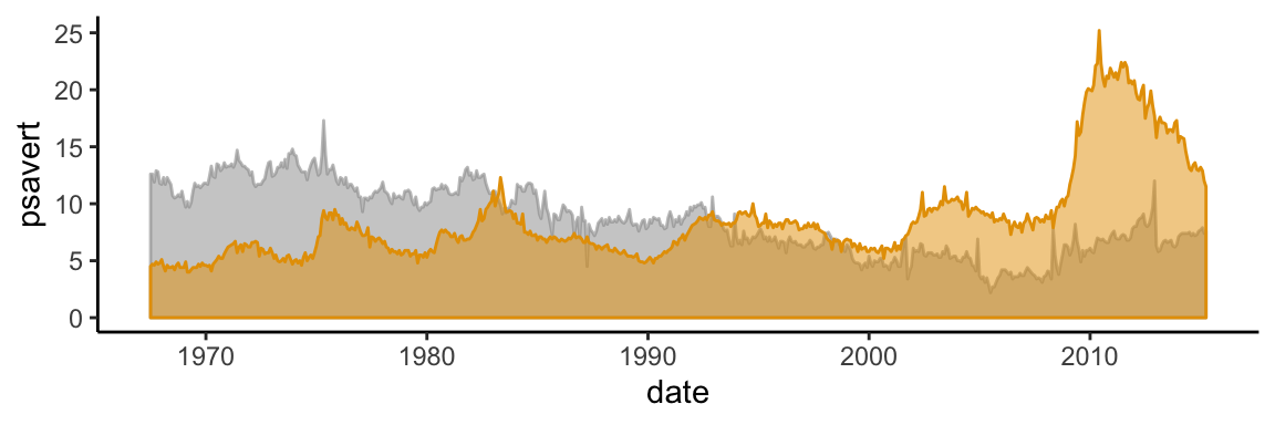
Conclusion
This article shows how to create line plots using the ggplot2 package.
Recommended for you
This section contains best data science and self-development resources to help you on your path.
Coursera - Online Courses and Specialization
Data science
- Course: Machine Learning: Master the Fundamentals by Stanford
- Specialization: Data Science by Johns Hopkins University
- Specialization: Python for Everybody by University of Michigan
- Courses: Build Skills for a Top Job in any Industry by Coursera
- Specialization: Master Machine Learning Fundamentals by University of Washington
- Specialization: Statistics with R by Duke University
- Specialization: Software Development in R by Johns Hopkins University
- Specialization: Genomic Data Science by Johns Hopkins University
Popular Courses Launched in 2020
- Google IT Automation with Python by Google
- AI for Medicine by deeplearning.ai
- Epidemiology in Public Health Practice by Johns Hopkins University
- AWS Fundamentals by Amazon Web Services
Trending Courses
- The Science of Well-Being by Yale University
- Google IT Support Professional by Google
- Python for Everybody by University of Michigan
- IBM Data Science Professional Certificate by IBM
- Business Foundations by University of Pennsylvania
- Introduction to Psychology by Yale University
- Excel Skills for Business by Macquarie University
- Psychological First Aid by Johns Hopkins University
- Graphic Design by Cal Arts
Amazon FBA
Amazing Selling Machine
Books - Data Science
Our Books
- Practical Guide to Cluster Analysis in R by A. Kassambara (Datanovia)
- Practical Guide To Principal Component Methods in R by A. Kassambara (Datanovia)
- Machine Learning Essentials: Practical Guide in R by A. Kassambara (Datanovia)
- R Graphics Essentials for Great Data Visualization by A. Kassambara (Datanovia)
- GGPlot2 Essentials for Great Data Visualization in R by A. Kassambara (Datanovia)
- Network Analysis and Visualization in R by A. Kassambara (Datanovia)
- Practical Statistics in R for Comparing Groups: Numerical Variables by A. Kassambara (Datanovia)
- Inter-Rater Reliability Essentials: Practical Guide in R by A. Kassambara (Datanovia)
Others
- R for Data Science: Import, Tidy, Transform, Visualize, and Model Data by Hadley Wickham & Garrett Grolemund
- Hands-On Machine Learning with Scikit-Learn, Keras, and TensorFlow: Concepts, Tools, and Techniques to Build Intelligent Systems by Aurelien Géron
- Practical Statistics for Data Scientists: 50 Essential Concepts by Peter Bruce & Andrew Bruce
- Hands-On Programming with R: Write Your Own Functions And Simulations by Garrett Grolemund & Hadley Wickham
- An Introduction to Statistical Learning: with Applications in R by Gareth James et al.
- Deep Learning with R by François Chollet & J.J. Allaire
- Deep Learning with Python by François Chollet
Version:
 Français

No Comments