A Quantile-quantile plot (or QQPlot) is used to check whether a given data follows normal distribution.
The data is assumed to be normally distributed when the points approximately follow the 45-degree reference line.
This article describes how to create a qqplot in R using the ggplot2 package.
Contents:
Related Book
GGPlot2 Essentials for Great Data Visualization in RKey R functions
- Key function:
stat_qq(). - Key arguments:
color,shapeandsizeto change point color, shape and size.
Data preparation
Create some data (wdata) containing the weights by sex (M for male; F for female):
set.seed(1234)
wdata = data.frame(
        sex = factor(rep(c("F", "M"), each=200)),
        weight = c(rnorm(200, 55), rnorm(200, 58))
        )

# head(wdata, 4)
Loading required R package
Load the ggplot2 package and set the default theme to theme_minimal() with the legend at the top of the plot:
library(ggplot2)
theme_set(
  theme_minimal() +
    theme(legend.position = "top")
  )
Create qqplots
Create a qq-plot of weight. Change color by groups (sex)
ggplot(wdata, aes(sample = weight)) +
  stat_qq(aes(color = sex)) +
  scale_color_manual(values = c("#00AFBB", "#E7B800"))+
  labs(y = "Weight")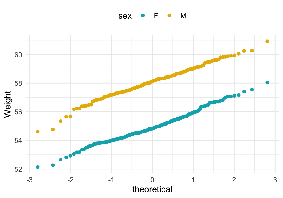
Alternative plot using the function ggqqplot() [in ggpubr]. The 95% confidence band is shown by default.
library(ggpubr)
ggqqplot(wdata, x = "weight",
   color = "sex",
   palette = c("#0073C2FF", "#FC4E07"),
   ggtheme = theme_pubclean())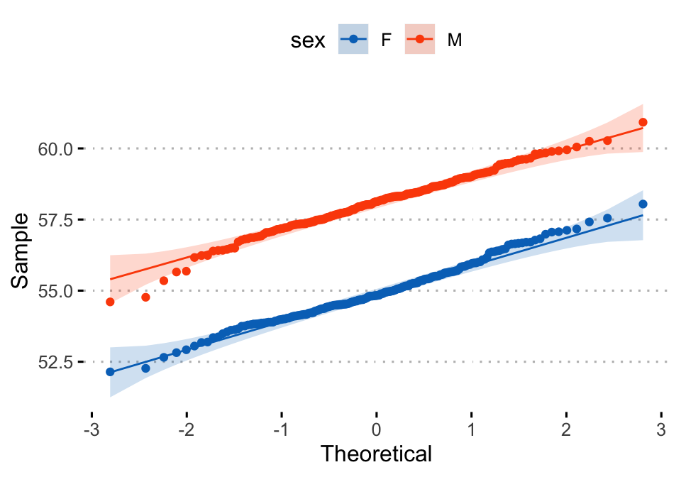
Conclusion
This article shows how to create a qqplot using the ggplot2 and the ggpubr package.
Recommended for you
This section contains best data science and self-development resources to help you on your path.
Books - Data Science
Our Books
- Practical Guide to Cluster Analysis in R by A. Kassambara (Datanovia)
- Practical Guide To Principal Component Methods in R by A. Kassambara (Datanovia)
- Machine Learning Essentials: Practical Guide in R by A. Kassambara (Datanovia)
- R Graphics Essentials for Great Data Visualization by A. Kassambara (Datanovia)
- GGPlot2 Essentials for Great Data Visualization in R by A. Kassambara (Datanovia)
- Network Analysis and Visualization in R by A. Kassambara (Datanovia)
- Practical Statistics in R for Comparing Groups: Numerical Variables by A. Kassambara (Datanovia)
- Inter-Rater Reliability Essentials: Practical Guide in R by A. Kassambara (Datanovia)
Others
- R for Data Science: Import, Tidy, Transform, Visualize, and Model Data by Hadley Wickham & Garrett Grolemund
- Hands-On Machine Learning with Scikit-Learn, Keras, and TensorFlow: Concepts, Tools, and Techniques to Build Intelligent Systems by Aurelien Géron
- Practical Statistics for Data Scientists: 50 Essential Concepts by Peter Bruce & Andrew Bruce
- Hands-On Programming with R: Write Your Own Functions And Simulations by Garrett Grolemund & Hadley Wickham
- An Introduction to Statistical Learning: with Applications in R by Gareth James et al.
- Deep Learning with R by François Chollet & J.J. Allaire
- Deep Learning with Python by François Chollet
Version:
 Français

No Comments