A Violin Plot is used to visualize the distribution of the data and its probability density.
This chart is a combination of a Box plot and a Density Plot that is rotated and placed on each side, to display the distribution shape of the data.
Typically, violin plots will include a marker for the median of the data and a box indicating the interquartile range, as in standard boxplots.
A Violin Plot shows more information than a Box Plot. For example, in a violin plot, you can see whether the distribution of the data is bimodal or multimodal.
This article describes how to create and customize violin plots using the ggplot2 R package.
Contents:
Related Book
GGPlot2 Essentials for Great Data Visualization in RKey R functions
Key function:
geom_violin(): Creates violin plots. Key arguments:color,size,linetype: Border line color, size and typefill: Areas fill colortrim: logical value. If TRUE (default), trim the tails of the violins to the range of the data. If FALSE, don’t trim the tails.
stat_summary(): Adds summary statistics (mean, median, …) on the violin plots.
Data preparation
- Demo dataset:
ToothGrowth- Continuous variable:
len(tooth length). Used on y-axis - Grouping variable:
dose(dose levels of vitamin C: 0.5, 1, and 2 mg/day). Used on x-axis.
- Continuous variable:
First, convert the variable dose from a numeric to a discrete factor variable:
data("ToothGrowth")
ToothGrowth$dose <- as.factor(ToothGrowth$dose)
head(ToothGrowth, 4)
## len supp dose
## 1 4.2 VC 0.5
## 2 11.5 VC 0.5
## 3 7.3 VC 0.5
## 4 5.8 VC 0.5Loading required R package
Load the ggplot2 package and set the default theme to theme_classic() with the legend at the top of the plot:
library(ggplot2)
theme_set(
  theme_classic() +
    theme(legend.position = "top")
  )
Basic violin plots
We start by initiating a plot named e, then we’ll add layers. The following R code creates Violin Plots combined with summary statistics (mean +/- SD) and Box Plots.
Create basic violin plots with summary statistics:
# Initiate a ggplot
e <- ggplot(ToothGrowth, aes(x = dose, y = len))
# Add mean points +/- SD
# Use geom = "pointrange" or geom = "crossbar"
e + geom_violin(trim = FALSE) +
stat_summary(
fun.data = "mean_sdl", fun.args = list(mult = 1),
geom = "pointrange", color = "black"
)
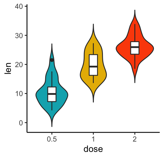
# Combine with box plot to add median and quartiles
# Change fill color by groups, remove legend
e + geom_violin(aes(fill = dose), trim = FALSE) +
geom_boxplot(width = 0.2)+
scale_fill_manual(values = c("#00AFBB", "#E7B800", "#FC4E07"))+
theme(legend.position = "none")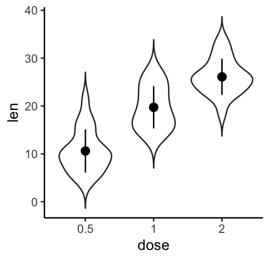
The function mean_sdl is used for adding mean and standard deviation. It computes the mean plus or minus a constant times the standard deviation. In the R code above, the constant is specified using the argument mult (mult = 1). By default mult = 2. The mean +/- SD can be added as a crossbar or a pointrange.
Create a Violin Plot with multiple groups
Two different grouping variables are used: dose on x-axis and supp as line color (legend variable).
The space between the grouped plots is adjusted using the function position_dodge().
e + geom_violin(aes(color = supp), trim = FALSE, position = position_dodge(0.9) ) +
  geom_boxplot(aes(color = supp), width = 0.15, position = position_dodge(0.9)) +
  scale_color_manual(values = c("#00AFBB", "#E7B800"))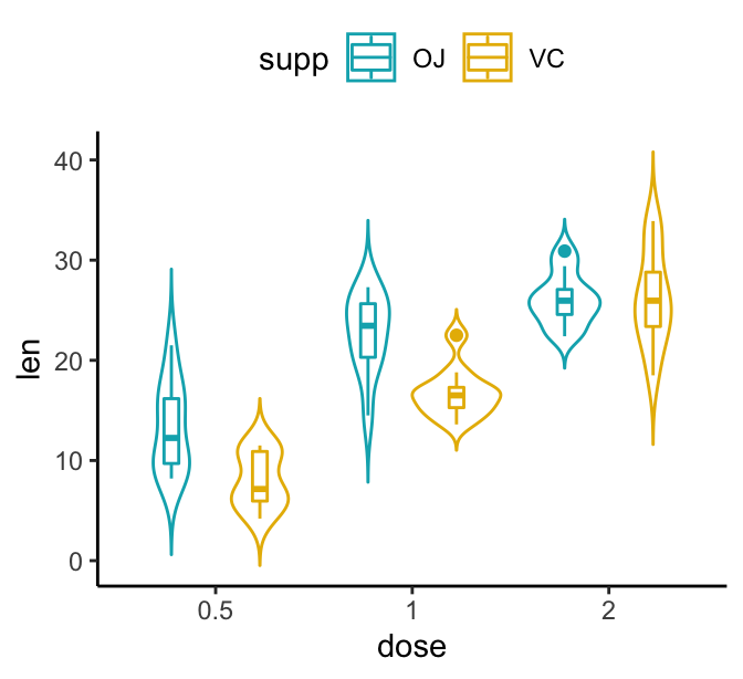
Conclusion
This article describes how to create a Violin Plot using the ggplot2 package.
Recommended for you
This section contains best data science and self-development resources to help you on your path.
Books - Data Science
Our Books
- Practical Guide to Cluster Analysis in R by A. Kassambara (Datanovia)
- Practical Guide To Principal Component Methods in R by A. Kassambara (Datanovia)
- Machine Learning Essentials: Practical Guide in R by A. Kassambara (Datanovia)
- R Graphics Essentials for Great Data Visualization by A. Kassambara (Datanovia)
- GGPlot2 Essentials for Great Data Visualization in R by A. Kassambara (Datanovia)
- Network Analysis and Visualization in R by A. Kassambara (Datanovia)
- Practical Statistics in R for Comparing Groups: Numerical Variables by A. Kassambara (Datanovia)
- Inter-Rater Reliability Essentials: Practical Guide in R by A. Kassambara (Datanovia)
Others
- R for Data Science: Import, Tidy, Transform, Visualize, and Model Data by Hadley Wickham & Garrett Grolemund
- Hands-On Machine Learning with Scikit-Learn, Keras, and TensorFlow: Concepts, Tools, and Techniques to Build Intelligent Systems by Aurelien Géron
- Practical Statistics for Data Scientists: 50 Essential Concepts by Peter Bruce & Andrew Bruce
- Hands-On Programming with R: Write Your Own Functions And Simulations by Garrett Grolemund & Hadley Wickham
- An Introduction to Statistical Learning: with Applications in R by Gareth James et al.
- Deep Learning with R by François Chollet & J.J. Allaire
- Deep Learning with Python by François Chollet
Version:
 Français

No Comments