data("titanic.raw", package = "datarium")

table(titanic.raw$Survived)                 # counts
  No  Yes
1490 711 round(prop.table(table(titanic.raw$Survived)), 2) # proportions
  No  Yes
0.68 0.32 Summarise categorical data — frequency and contingency tables, proportions and margins — and visualize them with bar, pie and mosaic plots
Learn to summarise categorical data in R — build one-way frequency tables and two-way (and multi-way) contingency tables with table() and xtabs(), add proportions and margins with prop.table() and addmargins(), and visualize the counts with bar charts, pie/donut charts, balloon plots and mosaic plots. The first step before any categorical test.
table() or xtabs(); add proportions with prop.table() and row / column / grand totals with addmargins().Before testing categorical data, describe it: how many observations fall into each category, and how the categories of two variables cross-classify. The summaries are counts — a one-way frequency table for a single variable, and a two-way (or multi-way) contingency table for several. This lesson builds them with base R and visualizes them, using the built-in Titanic survival data (titanic.raw).
table() counts each category; wrap it in prop.table() for proportions:
data("titanic.raw", package = "datarium")
table(titanic.raw$Survived) # counts
No Yes
1490 711 round(prop.table(table(titanic.raw$Survived)), 2) # proportions
No Yes
0.68 0.32 About 32% of the 2201 people survived.
Cross-tabulate two variables with table() or xtabs() — here survival by passenger class:
data("titanic.raw", package = "datarium")

tab <- xtabs(~ Class + Survived, data = titanic.raw)
tab
Survived
Class No Yes
1st 122 203
2nd 167 118
3rd 528 178
Crew 673 212Add margins (row / column / grand totals) and proportions:
data("titanic.raw", package = "datarium")
tab <- xtabs(~ Class + Survived, data = titanic.raw)

addmargins(tab)                       # totals
Survived
Class No Yes Sum
1st 122 203 325
2nd 167 118 285
3rd 528 178 706
Crew 673 212 885
Sum 1490 711 2201round(prop.table(tab, margin = 1), 2) # row proportions (survival rate within each class) Survived
Class No Yes
1st 0.38 0.62
2nd 0.59 0.41
3rd 0.75 0.25
Crew 0.76 0.24The row proportions are the survival rate within each class — first class ≈ 62%, crew ≈ 24%.
xtabs() and ftable() (flat tables) handle three or more variables — survival by class and sex:
data("titanic.raw", package = "datarium")

ftable(xtabs(~ Class + Sex + Survived, data = titanic.raw))
Survived No Yes
Class Sex
1st Male 118 62
Female 4 141
2nd Male 154 25
Female 13 93
3rd Male 422 88
Female 106 90
Crew Male 670 192
Female 3 20A bar chart of the counts, grouped by survival:
library(ggpubr)

data("titanic.raw", package = "datarium")
df <- as.data.frame(xtabs(~ Class + Survived, data = titanic.raw))

ggbarplot(df, x = "Class", y = "Freq", fill = "Survived", palette = "jco",
          position = position_dodge(0.8), ylab = "Count")
A balloon plot shows the whole table at a glance — dot size = count:
library(ggpubr)

data("titanic.raw", package = "datarium")
df <- as.data.frame(xtabs(~ Class + Survived, data = titanic.raw))

ggballoonplot(df, x = "Survived", y = "Class", size = "Freq", fill = "Freq") +
  gradient_fill(c("white", "#3a86d4"))
A mosaic plot (base R) shows proportions as tile areas — the width of each class reflects its size, the split shows its survival rate:
data("titanic.raw", package = "datarium")
tab <- xtabs(~ Class + Survived, data = titanic.raw)

mosaicplot(tab, color = c("#cccccc", "#3a86d4"), main = "Survival by class")
A pie or donut chart suits a single variable’s shares:
library(ggpubr)

data("titanic.raw", package = "datarium")
df <- as.data.frame(table(titanic.raw$Survived))
names(df) <- c("Survived", "n")

ggdonutchart(df, "n", label = "Survived", fill = "Survived", palette = "jco")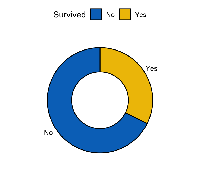
Tabulate and plot a different pair of variables — survival by sex. The sandbox boots on first Run.
Ask Prova “summarise my categorical data — build the contingency table with proportions and margins, and plot it” — it answers with code you can run on your own data. The runtime is the judge. Ask Prova →
You want proportions but got counts. Wrap the table in prop.table(). Use margin = 1 for row proportions, margin = 2 for column proportions, and no margin for the overall proportions.
Your variable is numeric but really categorical. Convert it to a factor first (mydata$x <- factor(mydata$x)) so table() treats each value as a category.
A multi-way table is hard to read. Use ftable() to flatten it into a readable layout, or a mosaicplot() to see the proportions visually.
Use table(var1, var2) or xtabs(~ var1 + var2, data = mydata) to cross-tabulate two categorical variables into a contingency table of counts. Add prop.table() for proportions and addmargins() for row/column/grand totals.
Wrap the table in prop.table(): with no margin you get the overall proportions; margin = 1 gives row proportions (each row sums to 1), margin = 2 gives column proportions. Multiply by 100 for percentages.
A bar chart for comparing category counts (grouped or stacked for two variables), a pie/donut chart for one variable’s shares, a balloon plot to show a whole contingency table at a glance, and a mosaic plot to show proportions as areas. Choose by how many variables you’re showing.
prop.table() margin do you use?Fill the blank with 1 for row proportions (rate within each sex). For question 2, the class is the row variable, so you want the same margin.
tab <- xtabs(~ Sex + Survived, data = titanic.raw)
round(prop.table(tab, margin = 1), 2)   #> females had a much higher survival rate.
For question 2: use margin = 1 (row proportions) — with class as the row variable, this gives the survival rate within each class, which is what you want. margin = 2 would instead give, within survivors and non-survivors, the share from each class.
Once you’ve described the table, test it:
You can now describe categorical data in R: build frequency and contingency tables with table() / xtabs(), add proportions (prop.table()) and margins (addmargins()), flatten multi-way tables with ftable(), and visualize with bar, pie/donut, balloon and mosaic plots. It is the first, essential step — the picture of the table you then take to a chi-square or other categorical test.
@online{2026,
  author = {},
  title = {Descriptive {Statistics} for {Categorical} {Data} in {R:}
    {Contingency} {Tables}},
  date = {2026-06-23},
  url = {https://www.datanovia.com/learn/biostatistics/categorical/categorical-descriptive-statistics-in-r},
  langid = {en}
}