library(ggpubr)

ggscatter(
  mtcars, x = "wt", y = "mpg",
  add = "reg.line", conf.int = TRUE,
  color = "#3a86d4",
  add.params = list(color = "#1f4e79"),
  xlab = "Weight (1000 lbs)", ylab = "Miles per gallon"
) +
  stat_cor(method = "pearson")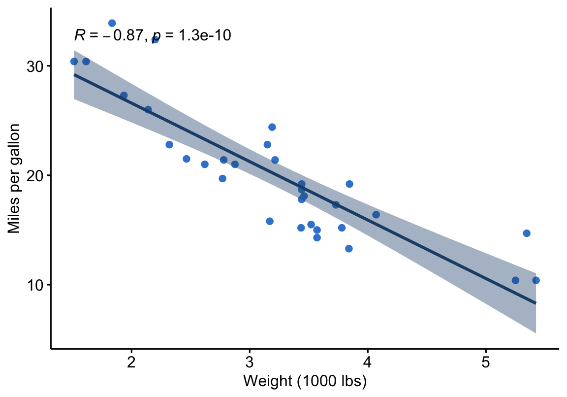
The Correlation series: measure and visualize relationships in R — the correlation test (Pearson, Spearman, Kendall) and the correlation matrix — with the tidy rstatix workflow, the base-R equivalent, and ggpubr plots.
Learn › Biostatistics › Correlation
Correlation measures how two variables move together — the foundation of relationship analysis in statistics. This series covers the two questions people actually search for: “do these two variables correlate?” (the correlation test — Pearson, Spearman or Kendall) and “how do all my variables relate?” (the correlation matrix). Each lesson leads with the tidy rstatix workflow, shows the base-R cor.test() / cor() equivalent, and visualizes the result with ggpubr.
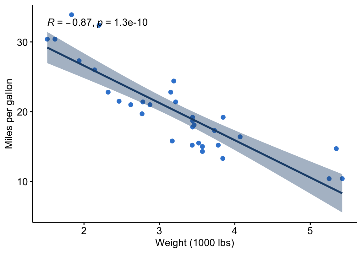
cor_test() from rstatix gives a tidy answer — the coefficient, its confidence interval and the p-value — and ggpubr::ggscatter() draws the relationship with the statistic printed on the panel. A single relationship from the built-in mtcars data:
library(ggpubr)
ggscatter(
mtcars, x = "wt", y = "mpg",
add = "reg.line", conf.int = TRUE,
color = "#3a86d4",
add.params = list(color = "#1f4e79"),
xlab = "Weight (1000 lbs)", ylab = "Miles per gallon"
) +
stat_cor(method = "pearson")
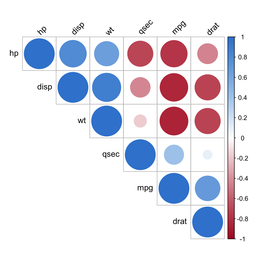
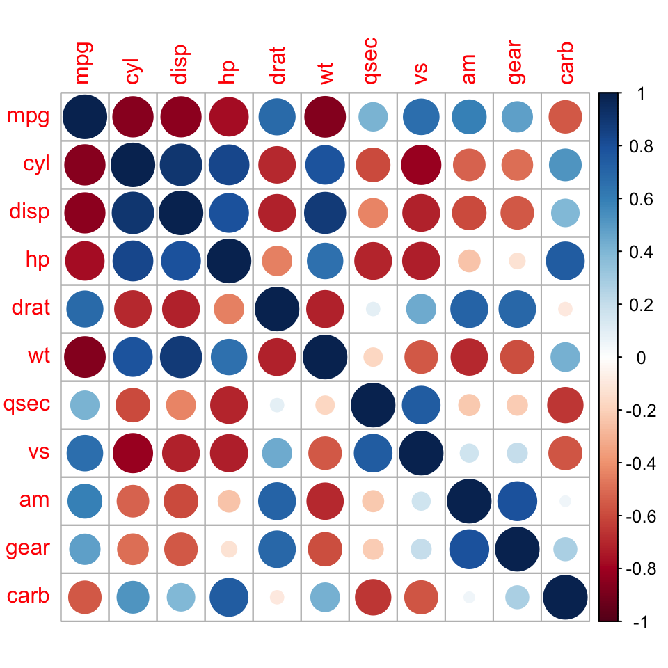
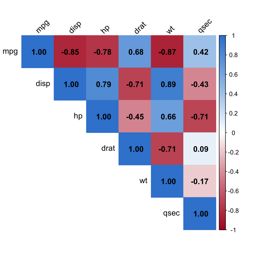
Many variables at once. A correlation matrix summarizes every pairwise relationship; a quick heatmap makes the structure obvious — here for six numeric columns of mtcars:
library(corrplot)

m <- cor(mtcars[, c("mpg", "disp", "hp", "drat", "wt", "qsec")])
corrplot(
  m, method = "color", type = "upper",
  addCoef.col = "black", tl.col = "black", tl.srt = 45,
  col = colorRampPalette(c("#b2182b", "white", "#3a86d4"))(200)
)
That is the whole series: a clear coefficient with its p-value, and a readable picture of how your variables relate.
This series is filling in wave by wave — the correlation test first (the most-searched: is the relationship significant?), then the correlation matrix (analyze, format and visualize), with the correlogram to follow. The plotting side lives in the ggpubr scatter + correlation lesson.
Ask Prova “is the correlation between these two variables significant, and which method should I use?” — it answers with rstatix code you can run on your own data, then helps you read the coefficient and p-value. The runtime is the judge. Ask Prova →
Prove you can do it. Master the whole Correlation in R series — track your path, build projects, and earn a certificate.
Go Pro — unlimited Prova on your own data and a verifiable certificate that proves the skill.
from $15/mo billed yearly
✓ You're Pro — keep going. The runtime is the judge.
@online{untitled,
  author = {},
  title = {Correlation},
  url = {https://www.datanovia.com/learn/biostatistics/correlation/},
  langid = {en}
}