M <- cor(mtcars)
round(M[1:4, 1:4], 2)   # a corner of the 11x11 matrix
mpg cyl disp hp
mpg 1.00 -0.85 -0.85 -0.78
cyl -0.85 1.00 0.90 0.83
disp -0.85 0.90 1.00 0.79
hp -0.78 0.83 0.79 1.00Turn a correlation matrix into a clear, colour-coded graph — methods, layouts, hierarchical reordering and significance marks — with the corrplot package
Learn to draw a correlogram in R — a graphical display of a correlation matrix — with the corrplot package. Compute the matrix with cor(), then visualize it with different methods (circle, pie, colour, number), upper/lower layouts, hierarchical reordering, custom colours, and significance marks that cross out non-significant correlations.
cor(), then draw it with corrplot::corrplot().circle, pie, color, number) and a layout (type = "upper"/"lower"/ "full"); reorder with order = "hclust" to surface clusters of related variables.p.mat) so corrplot crosses out non-significant correlations.A correlogram is a graphical display of a correlation matrix — a grid where each cell’s colour and shape encode the correlation between two variables. It is the fastest way to spot the most correlated variables in a dataset and to reveal hidden structure by reordering related variables next to each other.
This lesson uses the corrplot package — the standard correlogram tool in R — on the built-in mtcars data. You compute the matrix once with base cor(), then explore it visually. (To compute the matrix and its p-values in a tidy, pipe-friendly way, see the correlation matrix lesson.)
cor() returns the matrix of pairwise Pearson correlations:
M <- cor(mtcars)
round(M[1:4, 1:4], 2) # a corner of the 11x11 matrix mpg cyl disp hp
mpg 1.00 -0.85 -0.85 -0.78
cyl -0.85 1.00 0.90 0.83
disp -0.85 0.90 1.00 0.79
hp -0.78 0.83 0.79 1.00corrplot() renders the whole matrix as a graph. The default method = "circle" sizes and colours a circle by the correlation — blue for positive, red for negative:
library(corrplot)

M <- cor(mtcars)
corrplot(M, method = "circle")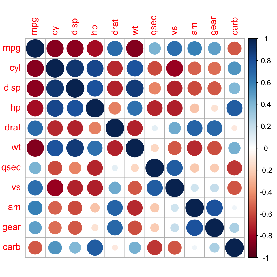
Beyond the default circle, corrplot() offers several encodings — pick the one that reads best for your audience and the size of your matrix:
square and color fill each cell like a compact heatmap — the cleanest choice for a large matrix where you just need to see where the strong blocks are.ellipse shows direction and strength at a glance: the ellipse gets narrower and tilts toward a straight line as the correlation approaches ±1 (leaning right for positive, left for negative).circle and pie encode magnitude by area — a bigger circle, or a fuller pie slice, means a stronger correlation.number prints the exact coefficient, and shade is a colour fill with diagonal shading.library(corrplot)
M <- cor(mtcars)
par(mfrow = c(2, 3))
corrplot(M, method = "square")
corrplot(M, method = "ellipse")
corrplot(M, method = "number")
corrplot(M, method = "color")
corrplot(M, method = "pie")
corrplot(M, method = "shade")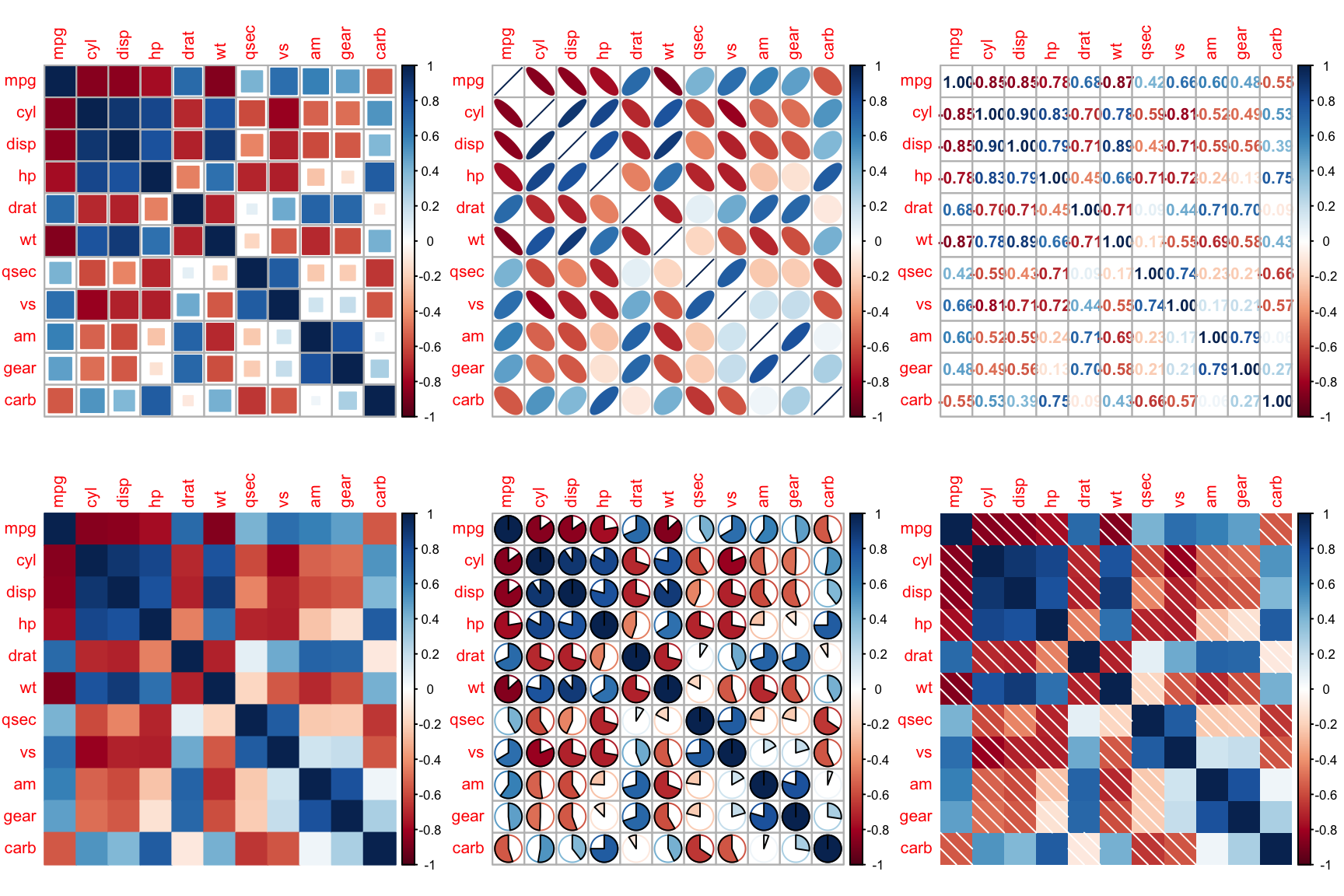
par(mfrow = c(1, 1))Show only the upper (or lower) triangle to avoid the redundant mirror image, and reorder with hierarchical clustering (order = "hclust") so correlated variables sit together — the structure becomes obvious:
library(corrplot)

M <- cor(mtcars)
corrplot(M, type = "upper", order = "hclust", tl.col = "black", tl.srt = 45)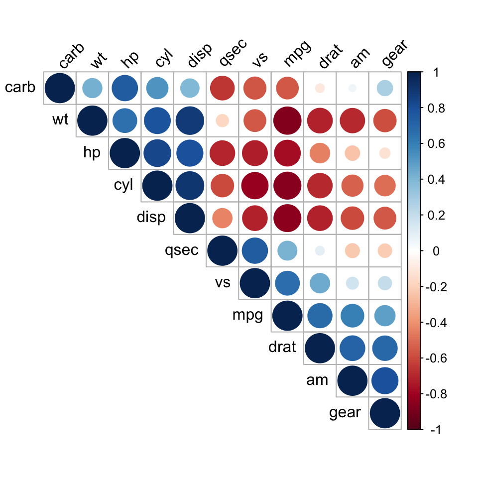
corrplot() ships with a blue–red scale, but you control it through the col = argument — pass any vector of colours and corrplot maps it across the correlation range, from the most negative value (the first colour) through zero to the most positive value (the last colour). Build a smooth diverging ramp with base colorRampPalette(): give it the negative-end colour, "white" for zero, and the positive-end colour, then ask for a fine gradient. Here we keep the brand azure #3a86d4 for positive correlations and a deep red for negative ones:
library(corrplot)

M <- cor(mtcars)

col <- colorRampPalette(c("#b2182b", "white", "#3a86d4"))(200)
corrplot(M, method = "color", col = col)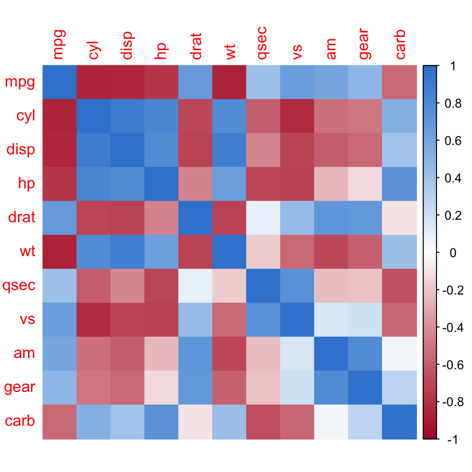
The (200) asks colorRampPalette() for 200 interpolated colours, so the fill shades smoothly instead of in visible steps.
For a ready-made, publication-tested scale, wrap an RColorBrewer diverging palette in the same ramp. RdBu, BrBG, PuOr and PRGn are among the colourblind-safe diverging palettes — reach for one of these when the sign of each correlation must stay readable for every reader:
library(corrplot)
library(RColorBrewer)

M <- cor(mtcars)

col <- colorRampPalette(brewer.pal(n = 8, name = "RdBu"))(200)
corrplot(M, type = "upper", order = "hclust", col = col,
         tl.col = "black", tl.srt = 45)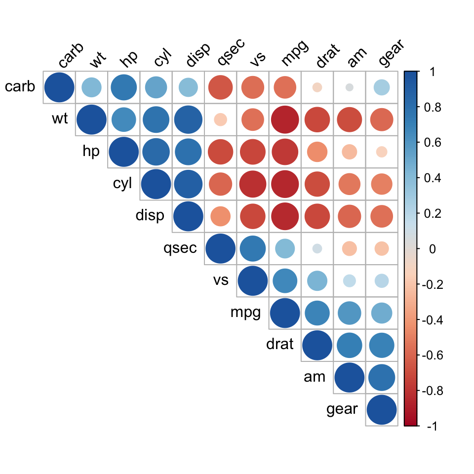
brewer.pal() returns only eight discrete colours; wrapping it in colorRampPalette(...)(200) interpolates them into a smooth 200-step gradient. As in the layout section, tl.col and tl.srt set the text-label colour and rotation.
A correlation can be near zero by chance — mark which ones are real. Compute a p-value matrix with a small helper (looping cor.test() over every pair), then pass it as p.mat with a sig.level: corrplot crosses out the non-significant cells:
library(corrplot)

M <- cor(mtcars)

# p-value matrix: cor.test() for every pair
cor.mtest <- function(mat) {
  mat <- as.matrix(mat)
  n <- ncol(mat)
  p.mat <- matrix(NA, n, n)
  diag(p.mat) <- 0
  for (i in 1:(n - 1)) {
    for (j in (i + 1):n) {
      p.mat[i, j] <- p.mat[j, i] <- cor.test(mat[, i], mat[, j])$p.value
    }
  }
  colnames(p.mat) <- rownames(p.mat) <- colnames(mat)
  p.mat
}
p.mat <- cor.mtest(mtcars)

corrplot(M, type = "upper", order = "hclust",
         p.mat = p.mat, sig.level = 0.05, tl.col = "black", tl.srt = 45)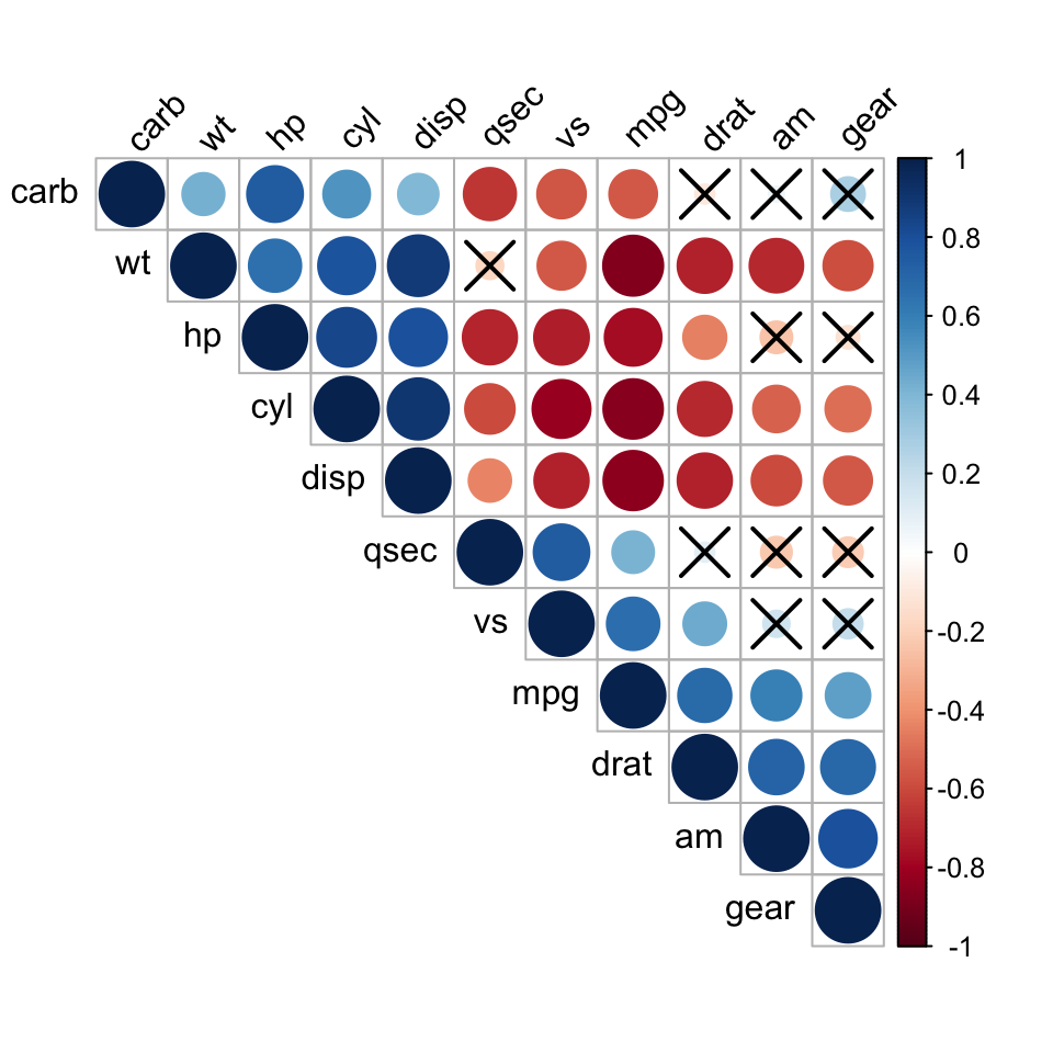
The crossed-out cells are correlations that are not statistically significant at the 0.05 level — keep your interpretation to the cells that survive.
Draw a correlogram of a different dataset, or change the method and ordering. The sandbox boots on first Run.
Ask Prova “draw a correlogram of my data’s correlation matrix, reorder it to show clusters, and cross out the non-significant correlations” — it answers with corrplot code you can run on your own data. The runtime is the judge. Ask Prova →
Non-numeric columns break cor(). cor() needs an all-numeric matrix — drop or convert factor/character columns first (e.g. cor(mydata[sapply(mydata, is.numeric)])).
Missing values return NA. With incomplete data, add use = "pairwise.complete.obs" to cor() so each correlation uses the pairs that are present.
The plot looks cluttered with many variables. Use type = "upper" (or "lower") to drop the redundant half, order = "hclust" to group related variables, and consider method = "color" rather than numbers for a large matrix.
A correlogram is a graphical representation of a correlation matrix — a grid in which each cell’s colour and shape encode the correlation between two variables. It makes the strongest positive and negative relationships easy to see at a glance, especially after reordering related variables together.
Compute the correlation matrix with cor(data), then draw it with corrplot::corrplot(M). Choose a method (circle, color, number, pie), a layout (type = "upper"), and order = "hclust" to cluster related variables. Add a p-value matrix via p.mat to mark non-significant correlations.
Compute a p-value matrix (loop cor.test() over each pair, or use rstatix::cor_pmat()), then pass it to corrplot() as p.mat with sig.level = 0.05. By default corrplot crosses out the cells whose p-value exceeds the threshold, leaving only the statistically reliable correlations.
A correlation matrix is the table of correlation coefficients (numbers); a correlogram is its visual form. Compute the matrix with cor() or rstatix::cor_mat() (see the correlation matrix lesson); visualize it with corrplot().
iris columns with the color method. Fill the blank.order = "hclust" useful, and what does crossing out a cell mean?Fill the blank with "upper" (or "lower"). For question 2, recall that clustering puts correlated variables side by side, and a crossed-out cell relates to the significance test.
M <- cor(iris[, 1:4])
corrplot(M, method = "color", type = "upper", order = "hclust")
#> Petal.Length & Petal.Width cluster together (strongly correlated).
For question 2: order = "hclust" groups mutually correlated variables next to each other, revealing blocks of related variables that a raw alphabetical order hides. A crossed-out cell marks a correlation that is not statistically significant (p > the chosen sig.level), so it should not be interpreted.
You can now draw a correlogram in R with corrplot: compute the matrix with cor(), then visualize it — choosing a method and layout, reordering with order = "hclust" to expose clusters, and overlaying a significance test so non-significant correlations are crossed out. It is the fastest way to read a correlation matrix and to communicate which relationships in your data are real.
@online{2026,
  author = {},
  title = {Correlogram in {R:} {Visualize} a {Correlation} {Matrix} with
    Corrplot},
  date = {2026-06-23},
  url = {https://www.datanovia.com/learn/biostatistics/correlation/correlogram-in-r},
  langid = {en}
}